Author: admin

  • Did Iittala make glass for Nordisk Solar?

    Did Iittala make glass for Nordisk Solar?

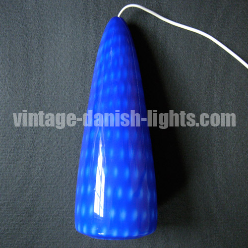
    Kristiina, a reader from Finland, recently brought our attention to an item for sale on Finnish auction website Huuto – a lamp that, using our ID Your Vintage Danish Lights site, she had identified as a Nordisk Solar Compagni P278g glass pendant light. Interestingly, however, the glass was embellished with an Iittala Oy glassworks sticker (pictured bottom).

    There are three possible explanations for this surprising detail. One is that someone added the sticker at a later date and it actually has nothing to do with the light. The second is that Iittala licensed the design from Nordisk Solar Compagni and produced the light in Finland. And the third is that Nordisk Solar contracted out the production of glass for its lamps to Iittala rather than Holmegaard (the home-grown choice of Fog & Mørup) or Orrefors (Lyfa’s preferred glass producer).

  • Hammerborgs on film

    Hammerborgs on film

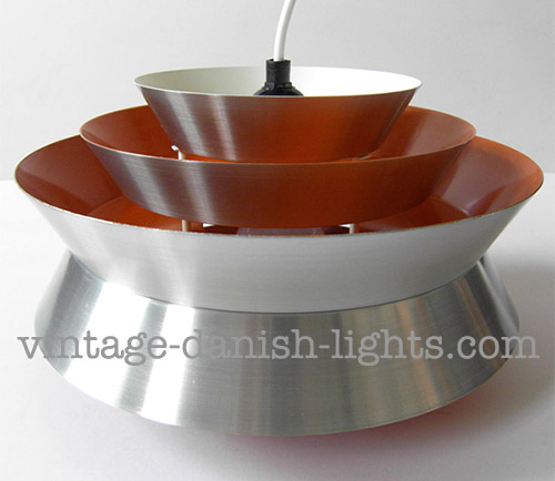
    Since becoming addicted to The Killing and Borgen we’ve tried out a mixed bag of other Danish TV series, and most recently have been watching The Protectors (Livvagterne in Danish). The set designer is clearly a Hammerborg fan, which has provided an entertaining sideline to the main action as we compete to see who can spot the Hammerborg lights first. We’ve taken snaps of some of our finds – in order of appearance: the Lento, the Single and the Ultra.


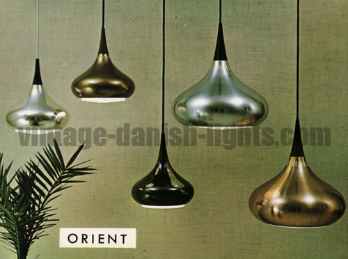
  • Why Jo Hammerborg’s Orient is incomplete without its louvre

    Why Jo Hammerborg’s Orient is incomplete without its louvre

    So the first Jo Hammerborg light reproduction has finally appeared, and the wisdom of the crowd has made itself apparent in our poll by correctly predicting that the chosen model would be the Orient.

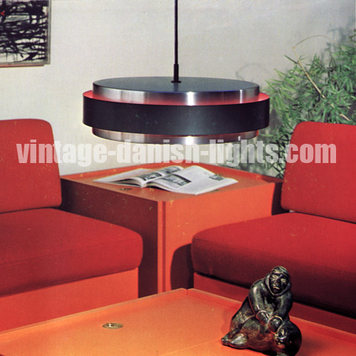
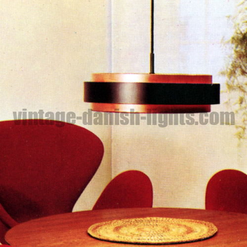
    We haven’t yet had the opportunity to see the new Orient except in the publicity photos issued by its producer Lightyears, so are unable to make any judgement about its quality or be certain about our impression that the rosewood finial in the new version appears to be a straight-sided cone rather than the tapered original which carried the curve of the domed body right up to the tip of the lamp.

    But what is clear is that the Orients in Lightyears’ photos have no louvre/diffuser in place, and further investigation reveals that the company has omitted this feature in the new version.

    Why does this seems like a fundamental oversight to us?

    First of all, the louvre wasn’t an optional extra in the original Orient – it was designed, produced and sold as an integral part of the light, and was created specifically for the Orient. Price lists issued to Fog & Mørup retailers included a section entitled “Replacement parts of acrylic and louvres”, in which each replacement part was listed by the name of the light for which it had been created. For example, in the retailers’ price list for February 1967 we see:

    Replacement parts of acrylic and louvres
    …
    Orient minor E5958 Dkr 5.25
    Orient major E5959 Dkr 7.75
    …

    Secondly, the louvre’s function is to filter and soften the light cast by the lamp. This isn’t about direct glare from the bulb – which is housed high enough within the dome-shaped body to be out of sight except when viewed from directly beneath the lamp – it’s about the overall quality of the light Jo Hammerborg intended to emerge from the lamp.

    The fact that specific attention was paid at Fog & Mørup to the amount and quality of light emitted from a lamp is illustrated by the instruction in a Fog & Mørup catalogue not to use opalescent bulbs in Sophus Frandsen’s Fibonacci: “For the Fibonacci lamp only clear bulbs should be used, as anti-dazzling and the right distribution of light can only be obtained with the correct bulb. The lampholder is adjustable to the various bulb sizes, so that the distance to the shades can always be correct.”

    This is not something Hammerborg was in any way careless or carefree about – as head of design at F&M his attention to detail was unparalleled in his day, and no feature – no matter how small or apparently insignificant – escaped his notice. Every F&M light created during Hammerborg’s reign displays the stamp of his meticulous approach. His relentless attention to detail included every component, both visible and concealed, and even the most apparently insignificant components such as bulbholders, studs and switches were designed specifically to fit with the F&M aesthetic and quality standards. It is this above anything else that defines the F&M brand during the period that Hammerborg was at the company.

    But perhaps the outstanding feature of Jo Hammerborg’s own designs is the perfect harmony he achieved between form and function. In keeping with the modernist principles that informed his intellectual approach to design, his forms are sparse and elegant, free from any gratuitous decorative flourishes yet effortlessly beautiful from every angle, revealing in their economy and restraint his training as a silversmith at Georg Jensen.

    Without the louvre, the folded-back lip on the Orient’s bottom edge becomes a decorative flourish. Hammerborg created it to support and restrain the louvre. Without the louvre the folded lip loses its purpose and the Orient loses some of its credentials as a modernist light. Furthermore, without the louvre the lamp has an unfinished look, and viewed from beneath seems naked.

    The Orient was also an exercise in the use of different materials with contrasting qualities, textures and colours – a theme that runs through much of 20th century modernism and whose influence can still be seen in architecture today. Look, the Orient says, here are three completely different materials – copper, wood and plastic, and don’t they work well together?

    Lightyears’ publicity for the new Orient claims that their reproduction is faithful to Hammerborg’s original design, but by excluding the louvre from the lamp they have removed a functional feature of the light and undermined both its aesthetic harmony and its intellectual underpinnings. They have forgotten, or failed to recognise, the fact that Hammerborg’s designs were the products of a perfectionist mind, conceived intellectually and produced with careful and deliberate attention to every detail.

    But maybe it’s not too late for Lightyears to reverse this ill-advised decision. Changing their minds and getting the louvres made up wouldn’t require any alterations to the copper bodies they have produced and would be a fitting tribute to Jo Hammerborg’s genius.
  • Changes ahead in the market for Jo Hammerborg lights

    Changes ahead in the market for Jo Hammerborg lights

    One of the features that has driven the increasing popularity of 60s and 70s Fog & Mørup lighting as a target for collectors – along with the consistently high quality and design excellence of the individual lights themselves and the cohesiveness of the F&M brand as a whole during this period – has been the fact that (with the exception of the Semi) the lights have never been reproduced. This has given the lights a scarcity value and has made them attractive to new collectors, who have not needed to study up on subtle historical design and production changes to be sure that they are buying a vintage model rather than one made last year.

    But this is soon to change, as a little bird tells us that a number of Jo Hammerborg’s Fog & Mørup light designs are to be reproduced, with the first of them due to become available within months. We expect a big shake-up in the market for vintage Hammerborg lights to follow.

    The precise effects that the arrival of these new productions will have on the vintage market will depend on several factors, amongst them the degree to which they match the quality standards of the originals and whether any aspects of the designs have been changed to accommodate modern production methods and materials and/or perceived changes in public tastes.

    If the new lamps are similar in appearance and quality to the originals, one effect may be a drop in demand for originals that are in less than excellent condition, as a proportion of the buyers who currently purchase Hammerborg designs purely for their aesthetic and functional qualities (and not as collectables) opt for new versions in preference to substandard originals. Lamps with visible dents, scratches or rust, with missing parts such as anti-glare louvres or acrylic plates, or that have been subjected to repainting are all likely to become relatively less attractive to these buyers. Those in the very best condition, meanwhile, are likely to hold or increase their value as awareness of the lights is brought to a wider audience, a proportion of whom will seek out originals that will maintain their value rather than buy a reissue.

    On the other hand, if the reissued lamps differ significantly from the originals in quality and/or design features, the effect they might have on the vintage market is harder to predict. While awareness of Hammerborg lamps amongst the general population may grow, the understanding of what buyers expect individual lights to look and feel like may become less clear-cut. Buyers with access to both old and new versions (who will of course tend to be those based in Denmark) may compare the two and choose to purchase vintage originals, leading to a local boost in the vintage sector. But for the wider international market, where people are less likely to have the opportunity to experience both versions “in the flesh”, a poorer-quality reissue may lead those who come across it to have a distorted understanding of the high quality standards of an original F&M production.

    While we wait to see what actually emerges from this new project, we have been speculating amongst ourselves about the identity of the first Hammerborg light to be reissued. Want to join the guessing game? Take part in our poll!


  • Fog & Morup did not produce Carl Thore lights

    Fog & Morup did not produce Carl Thore lights

    In recent months we have noticed an apparent increase in the number of eBay sellers repeating the incorrect claim that the multilayered pendant lamps usually known as Carl Thore lights were produced by Fog & Mørup. The true origin of the Carl Thore lamps and the story behind them was rigorously investigated earlier this year by Viveca Carlsson, editor of Swedish magazine Hus & Hem Retro, and a brief outline of the story was published in the June 2012 issue of the magazine. During our own correspondence with Viveca on the subject, however, she shared with us additional details that were not included in the magazine article but which should help put the Carl Thore F&M myth firmly to rest.

    Sigurd Lindkvist Carl Thore Granhaga Trava lamp

    The real name of the designer known as Carl Thore was Sigurd Lindkvist, and he was born in 1916 in Amal in Sweden’s Dalsland. After working for a lighting firm called Luko, in 1961 Lindkvist joined Granhaga Metallindustri, for whom he designed lights and was also head of sales, remaining with the company until he retired in around 1981. Lindkvist adopted the pseudonym Carl Thore for his Granhaga light designs on the spur of the moment when he was presenting the lights to a client who asked the identity of the designer. “Carl Thore,” Lindkvist blurted out, these being his two middle names. Thereafter the Granhaga lights were embellished with a small label on which the words “Design Carl Thore” were printed in a handwritten-style font.

    Sigurd Lindkvist Carl Thore Granhaga Trava lamp
    Sigurd Lindkvist Carl Thore Granhaga Trava lamp

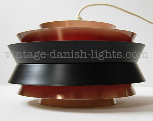
    The most popular and widely distributed of Lindkvist’s Carl Thore lamp designs for Granhaga (and his best-known design today) was the appropriately named Trava (Stack in English). Travas were produced in several variations of style and size (five of which are pictured here) and were sold in Sweden through the Swedish Consumer Cooperatives chain of shops known as KF Interior. They were also exported in large quantities to a number of countries including Denmark (where they were sold through an agent whose name may have been Rhodes & Rhodes), the Netherlands (where they were sold through Philips), England and South Africa.

    Sigurd Lindkvist Carl Thore Granhaga Trava lamp
    Sigurd Lindkvist Carl Thore Granhaga Trava lamp

  • Jo Hammerborg and the Formland lamp series

    Jo Hammerborg and the Formland lamp series

    The information that emerged from our correspondence with the Hammerborg family over the past 18 months (which has informed our new biography of Jo Hammerborg) has also provided interesting new perspectives on some of our previous Fog & Mørup blog posts.

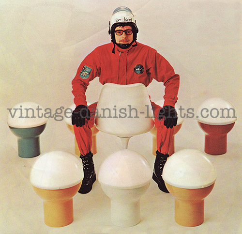
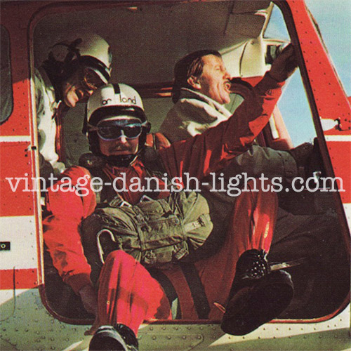
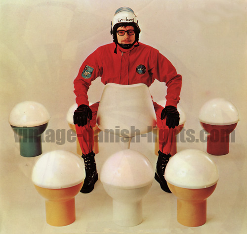
    The story of the launch party for Sidse Werner and Leif Alring’s Formland lamps, for example, which we wrote about in May 2010, gains an extra dimension in the light of the information that Jo Hammerborg was a keen skydiver and pilot, and that he had considerable involvement in the development of the Formland series.

    drawing of formland lamp as parachute

    The fascinating insight that the designer’s enthusiasm for sports in general and airborne sports in particular was based not only in his enjoyment of these activities in their own right, but also in the fact that he found them to be sources of ideas and inspiration in his business and creative life, strikes a strong chord in relation to the skydiving theme adopted for marketing the Formland series, illustrated in the images above and below.

    fog morup formland lamps skydiving theme
    fog morup formland lamps skydiving theme

    And further new light is cast on Hammerborg’s role in the Formland project by another snippet of information we gained from our correspondence with the Hammerborg family – the fact that Jo would often make use of his pilot’s licence to take other skydivers up for their jumps. This insight allowed us to view the Formland images through new eyes and see for the first time that the pilot at the controls in the image below is actually none other than our man himself – Jo Hammerborg!

    jo hammerborg pilot and skydiver

  • Our new website dedicated to Jo Hammerborg

    Our new website dedicated to Jo Hammerborg

    In May 2011 we wrote a post laying out the few facts we had been able to gather together during ten years of trawling through books, magazines, research libraries, personal contacts and the internet for information about Jo Hammerborg’s life and work at Fog & Mørup, and appealed for readers with any further information to contact us. Today, thanks to the generous assistance of Jo Hammerborg’s family, we have been able to add to that original post (which you can read here) a considerable amount of new information, in honour of which we have built a brand new website at johammerborg.com. We hope you will enjoy it.
    Jo Johannes Hammerborg Fog and Morup head of lighting design 1957 to 1980

  • Solved! the Danish star light designer mystery

    Solved! the Danish star light designer mystery

    A couple of years ago we wrote a post (which you can read here) about the fact that we had been unable to find reliable information about the origins of one of our favourite vintage Danish lights, a large and spiky creation that for obvious reasons we dubbed the star light. While various designers’ names had been mooted by auction houses and dealers, none of the claims were supported by original primary sources, and we had never found such a source ourselves.

    Then just last week we were delighted to receive an email from Elisabeth Jensen, daughter of Danish architect Anton Fogh Holm (1922–2005), who confirmed that the light had been designed for Nordisk Solar Compagni by her father together with Alfred J Andersen. The pair were also partners in an architectural practice in the town of Kolding. Elisabeth remembers her father referring to the light as “the Sydney light”, but it is unclear whether that name was also used by Nordisk Solar Compagni.

    Elisabeth reveals that her father designed other lights too, but these remained in private circulation amongst family and friends and were never put into general production – until Anton Fogh Holm’s grandson Kim Aagaard Holm revived and slightly modified his grandfather’s design for a self-assembly lamp made of card. Kim put the Holm lamp, as it was now called, into production in association with Aslaug Copenhagen in 2008.

    Anton Fogh Holm, image courtesy of Elisabeth Jensen

  • Another twist in the Jørn Utzon Søvaernspendel debate

    Another twist in the Jørn Utzon Søvaernspendel debate

    The identity of the designer of the Søvaernspendel, the light produced first by Nordisk Solar Compagni and later by Louis Poulsen, has been the subject of an ongoing debate on this blog over the past couple of years. Our previous posts and the valuable insights contributed by our readers on the issue can be read here, here and here.

    To summarise the key points of the debate so far:
    • Three versions of the light were produced, as pictured below. The first, pictured to the left, is the larger Nordisk Solar Compagni version; the second, pictured centre, is a more compact Nordisk Solar Compagni production; and the third, pictured right, is the Louis Poulsen version, a later production and the one most often seen today.*

    • The July 1956 issue of Mobilia magazine carries a picture of the smaller Søvaernspendel, attributing its design to Jørn Utzon. But the following month’s issue includes an erratum retracting that attribution.
    • Alternative suggestions as to the identity of the lamp’s designer have included Jørn Utzon’s naval architect father Aage, an anonymous member of the navy’s technical office, and architect Henning Klok.

    But a new contribution from one of our readers brings us back full circle to considering Jørn Utzon. Amongst the exhibits currently on display at the Utzon Centre in Aalborg, Denmark, Hans Jakobsen discovered two drawings for the Søvaernspendel’s design, one of them dated 3 March 1952 and labelled Søvaernspendlen, and the other including the Søværnets Bygningsdistrikt (Navy Buildings Department) logo. Hans took pictures of the drawings on his cameraphone and has kindly given us permission to reproduce them here.


    * UPDATE 8 October 2012: a reader from Denmark, Kurt Christensen, tells us that the Louis Poulsen version of the Søvaernspendel (discontinued circa the 1980s) is now back in production under a new name – the Doo-Wop!

  • The lights of Louis Weisdorf: Multi-Lite (1974)

    The lights of Louis Weisdorf: Multi-Lite (1974)

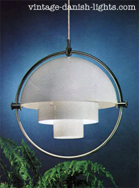
    Multi-LiteThe economic downturn of the 1970s brought new challenges for the designers of high-end lamps and other luxury goods, as producers’ support for the experiments of the 1960s gave way to a constant refrain of “No thanks”, “It’s too expensive”, or “It can’t be sold”.
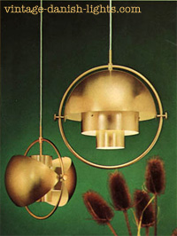
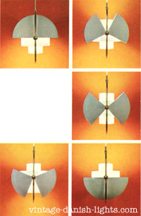
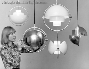
    Among Louis Weisdorf’s 1970s lamp designs, the Multi-Lite is one of the few to be taken into production – and if it hadn’t been for the climate of austerity and the consequent policy of restraint, it would be known today not just as a pendant light but also as a floor lamp and a wall light.Multi-Lite

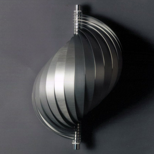
    The core of the Multi-Lite is a two-cylinder form that would work as a shade on its own but is additionally encompassed by a large metal ring anchoring two quarter-spherical shells. The shells can be individually rotated to create multiple arrangement combinations. In Weisdorf’s Copenhagen studio a large poster illustrates several of the numerous possible arrangements.Multi-Lite

    Weisdorf made the drawings for the Multi-Lite in 1972 and Lyfa produced it from 1974. It came out in two colourways – one in white with a chrome ring, and the other in matt-finished brass with a white interior.

    The Multi-Lite is an exception to the Weisdorf rule of multiply repeating elements, but reflects another of his passions – for objects that can do something, change into something else, be “multi”. Multi-LiteIt can be an uplighter one day, a downlighter the next, an asymmetrical art light the third. “It’s a bit more complex,” says Weisdorf about this light.
    The Multi-Lite’s timeless expression meant it fitted well into domestic settings in each of the following decades, so that it has been in use in many homes to this day and has consistently tended to fetch high prices at auction and elsewhere.

    © 2011 Sune Riishede and vintage-danish-lights.com. All rights reserved. This article is based on extensive correspondence between Louis Weisdorf and Sune Riishede and a personal meeting in November 2011 at the architect’s Copenhagen residence. The article and its contents may not be copied or reproduced in any part or form without the prior written permission of the copyright holders. Links to http://www.vintage-danish-lights.com/the-lights-of-louis-weisdorf-multi-lite-1974 are welcome.

  • The lights of Louis Weisdorf: Ekko (1968)

    The lights of Louis Weisdorf: Ekko (1968)

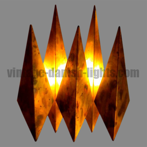
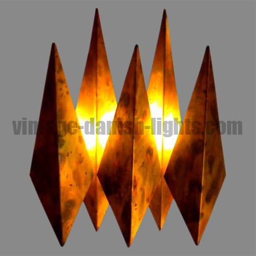
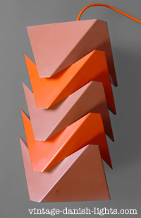
    EkkoThe Ekko is another of Louis Weisdorf’s designs based on repeating – or echoing – elements, though in this case the angular metallic sections take two forms, the two end pieces differing from the three central ones.

    The overall impression is a harmonious yet delicately balanced object that wouldn’t surprise you if it were to move or produce a sound. The layered triangular elements completely shield the eye from glare, while narrow beams of light escape to spread across the shade itself and highlight its angular sculptural form, adding to the lamp’s central downward illumination. “It’s quite a technical creation,” says Weisdorf. “I rather like its technicality.”

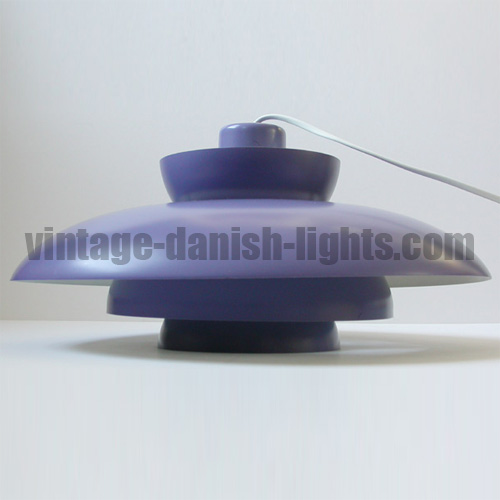
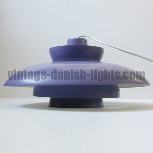
    The Ekko was designed in 1966 and produced by Lyfa from 1968, shortly after Weisdorf Ekko – while still at Tivoli – set up his own design studio in Kompagnistræde in Copenhagen’s old city, sharing the premises with architect Ole Panton (the younger brother of Verner), who also designed lamps. The Ekko had a diameter of 19cm and a height of 32cm, and came in two colour schemes – orange/terracotta and lilac/violet.
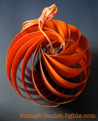
    Little is known about how long the Ekko remained in production or how many were made. Its relatively understated expression and the ease with which the sections can be separated from one another may have caused a proportion to be lost in the intervening years. It is only rarely seen for sale today, and because it is seldom recognised for what it is, prices tend to be lower than might be expected.

    © 2011 Sune Riishede and vintage-danish-lights.com. All rights reserved. This article is based on extensive correspondence between Louis Weisdorf and Sune Riishede and a personal meeting in November 2011 at the architect’s Copenhagen residence. The article and its contents may not be copied or reproduced in any part or form without the prior written permission of the copyright holders. Links to http://www.vintage-danish-lights.com/the-lights-of-louis-weisdorf-ekko-1968 are welcome.

  • The lights of Louis Weisdorf: Turbo (1967)

    The lights of Louis Weisdorf: Turbo (1967)

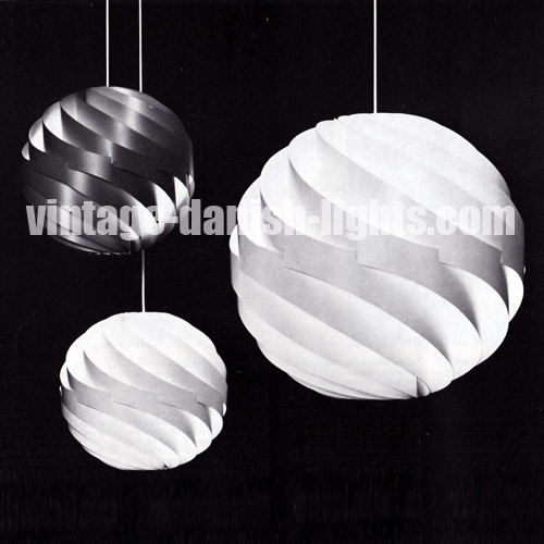
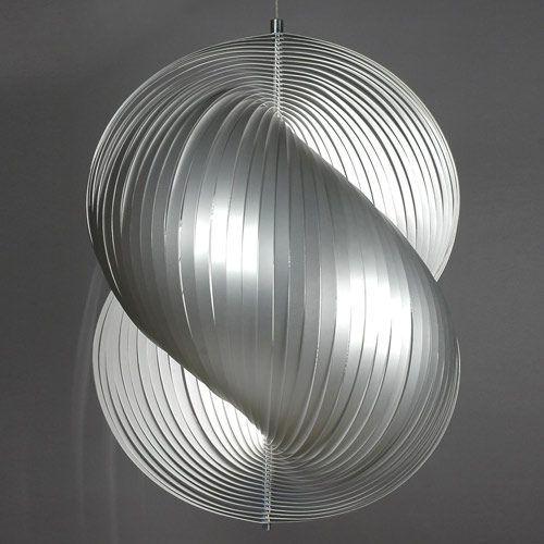
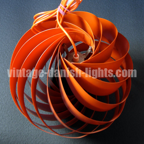
    TurboLouis Weisdorf created the design for his Turbo pendant light in 1965, and in 1967 Lyfa was ready to start production. Consisting of 12 uniform aluminium lamellae spiral-twisted to form a flower-like sphere, the Turbo was partly inspired by Japanese rice-paper lanterns, and came in two sizes – the 35cm diameter Turbo I (available in orange, red, beige or white) and the 60cm Turbo II (in white only).
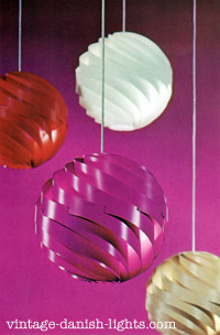
    In contrast to Konkylie the lamellae were positioned vertically, reducing the accumulation of dust but still conforming Turboto Weisdorf’s guiding principle of shielding the eye from direct bulb glare at all angles. Like other experimental lights of that decade, it was expensive – the larger version, Turbo II, coming with a price tag not much below an average worker’s monthly wage.

    The Turbo attracted quite some attention, winning an iF (Die gute Industrieform) product design award in 1973, and remained in production well into the 1970s. But after the economic downturn of the late 1970s the Turbo became one of numerous casualties of the subsequent merger between Lyfa and another major Danish lighting company, Fog & Mørup.

    TurboMuch later – in 1991 – a new version of the Turbo was put into production by the further-merged company Lyskjær-Lyfa, without the knowledge or approval of Louis Weisdorf. Renamed Regina and made of steel, the lamp was so heavy it had to be suspended by a wire. Weisdorf took the company to court and sales were halted.
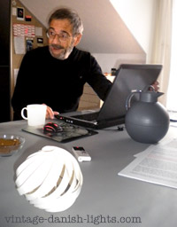
    In 2004 the Turbo was reissued again, in white versions of both original sizes – this time by Bald & Bang in agreement with the designer. The release coincided with a growing renewal of Turbointerest in Weisdorf’s lighting designs, and rekindled his passion for lamp design after 25 years during which he became one of the first Danish architects to move into the digital era and start using computer-aided design (CAD). The rediscovered lighting enthusiasm led to models of new lamp designs beginning to appear on his computer screens.
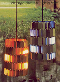
    When pushed to say whether he has a favourite amongst his own lighting designs, it is the Turbo that Louis Weisdorf points to. “I prefer the Turbo because of its logical simplicity, which makes it more timeless than many of my other lights,” he explains.

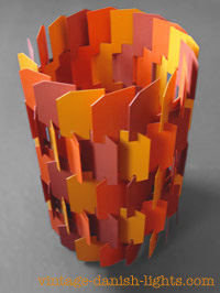
    © 2011 Sune Riishede and vintage-danish-lights.com. All rights reserved. This article is based on extensive correspondence between Louis Weisdorf and Sune Riishede and a personal meeting in November 2011 at the architect’s Copenhagen residence. The photo above left shows Louis Weisdorf in his studio with a miniature paper model of the Turbo. The article and its contents may not be copied or reproduced in any part or form without the prior written permission of the copyright holders. Links to http://www.vintage-danish-lights.com/the-lights-of-louis-weisdorf-turbo-1967 are welcome.

  • The lights of Louis Weisdorf: Facet (1966) and Facet-Pop (1970)

    The lights of Louis Weisdorf: Facet (1966) and Facet-Pop (1970)

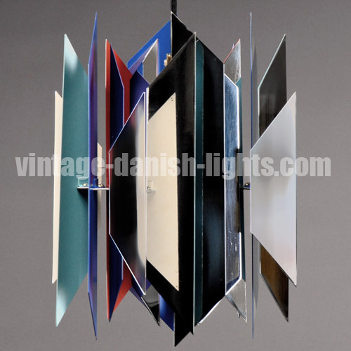
    FacetIn the Facet pendant light, designed by Louis Weisdorf in 1963 and produced by Lyfa from 1966, the particular art of Weisdorf’s lighting designs is perhaps most clearly visible. Like a 3D jigsaw puzzle, the Facet consists of 18 identical metallic elements, each a long punched and bent piece that fits into the next one, and that into the next, until a cylinder is formed. Light emerges through small gaps between the pieces, revealing the interior colours while protecting the eye from a direct light source.
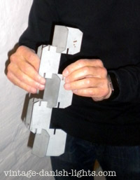
    FacetHow did Weisdorf think up the Facet? “I have always been interested in creating lights from a single element that could be repeated and built together in various fashions, fitting into each other, turned, stacked, hung in various ways and so on,” he says. “Since my youth I seemed to have an ability to visualise things in space, to see how forms function together in space. This was probably why I was accepted into architecture school in the first place.”
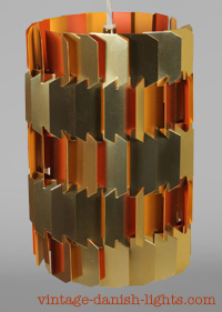
    FacetDuring the war the 11-year-old Weisdorf had to stay in Sweden for some years, and missed so much schooling that he was prevented from going on to high school. That didn’t stop him from finding a back door to academic studies by taking a preliminary year at engineering school (intended for craftsmen), then applying for admittance to the Royal Academy at the unusually early age of 17. Against all odds he was accepted on to the course, and during the three-month trial period the teachers spotted someone with a special gift in spatial geometry.
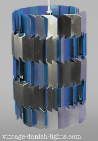
    FacetThis talent was of course used on the Konkylie, and meant Weisdorf was able to shape the Facet’s core element and visualise how it could repeat and come together without much drawing and model-building. The ingenuity of his construction was not wasted on the creative leadership of Lyfa, which in the positive spirit of the 1960s was open to the new and unexpected – even if it made the sceptical sales manager sleepless at night. Experiments were welcome.

    The Facet went into production in 1966 in the slipstream of the Konkylie Facetand, like the Konkylie, its production was contracted out by Lyfa to the Brødrene Berg factory. Its colour schemes harmonised with the Konkylie – one version golden outside with two shades of orange inside, the other silver outside and two shades of blue inside.
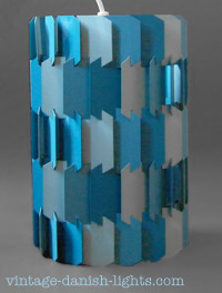
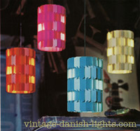
    Little is known about sales volumes for the Facet. Louis Weisdorf’s own recollection is that the quarterly payments he received from Lyfa were far from impressive (for this and his other lights), the percentage to the designer also being rather low.Facet

    Like the Konkylie, the Facet was rather expensive to produce, partly because it had different colouring on the outside and inside faces. Towards the end of the 1960s a growing demand for lower prices and different colours prompted a new version of the Facet – the Facet Pop, issued in 1970. The Facet Pop’s elements had the same colour on both sides, but shifted between three shades of the same colour, which gave the lamp a lively surface impression. The colour schemes were created by Tivoli artist Richard Branderup – three shades each of beige, orange, red and blue.Facet

    When Lyfa merged with Fog & Mørup later in the 1970s, most of Louis Weisdorf’s lights were phased out of production, along with many other Lyfa models. Today the Facet Pop is seen for sale more often than the original Facet, but both are increasingly hard to find. Despite their growing scarcity, however, prices for both lights currently tend to be fairly modest compared with others of similar quality and rarity.

    © 2011 Sune Riishede and vintage-danish-lights.com. All rights reserved. This article is based on extensive correspondence between Louis Weisdorf and Sune Riishede and a personal meeting in November 2011 at the architect’s Copenhagen residence. The article and its contents may not be copied or reproduced in any part or form without the prior written permission of the copyright holders. Links to http://www.vintage-danish-lights.com/the-lights-of-louis-weisdorf-facet-1966-and-facet-pop-1970 are welcome.

  • The lights of Louis Weisdorf: Konkylie (1964/65)

    The lights of Louis Weisdorf: Konkylie (1964/65)

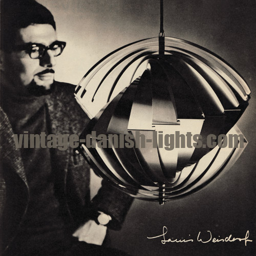
    KonkylieIn 1963 when Danish architect Louis Weisdorf made the drawings for Konkylie, the first of his light designs, nine years had passed since (aged 22) he’d been one of the youngest ever graduates of Copenhagen’s Royal Academy, and he was a couple of years into a 10-year assignment at the city’s recreation park, Tivoli Gardens.

    As the main assistant to Tivoli’s chief architect Simon P Henningsen, Weisdorf had drawn up the construction diagrams for several lights designed by Simon Henningsen for production by Lyfa, including the Divan 2 light for Tivoli’s Divan 2 restaurant in 1962. Being so closely involved in the process and attending meetings and Konkyliediscussions at Lyfa meant Weisdorf was well placed when the time came to present his own light designs.

    Konkylie was partly inspired at a technical level by Verner Panton’s Moon lamp, which was composed of a number of concentric circular slats hanging vertically. “I was especially interested in the method of mounting the slats,” Weisdorf explains. “I was drawn to designing lamps built from repeating elements, looking for a solution where you could combine the vertical suspension with uniform slats. The result was the Konkylie.”

    The original prototype of the Konkylie Konkyliewas made in transparent opal white plastic, because Weisdorf wanted it to be a good general light source. But the project really started rolling when Tivoli accepted his suggestion of a gold metallic version, which he envisaged hanging in large numbers from trees in the Gardens. The idea highlighted Konkylie’s sculptural art light qualities, and with Tivoli’s pre-order of 60-plus in hand, Lyfa became interested in putting the metallic version onto the general market.

    Lyfa’s production department, however, promptly announced that the light’s technical complexity meant it could not be made. Weisdorf approached Knud Bjerg of the KonkylieBrødrene Bjerg factory (who had in fact produced Simon P Henningsen’s Divan 2 lamp), and shortly afterwards he was able to present Lyfa with a finished copy of the lamp. So as with the Divan 2, Brødrene Berg ended up making the Konkylie on behalf of Lyfa.

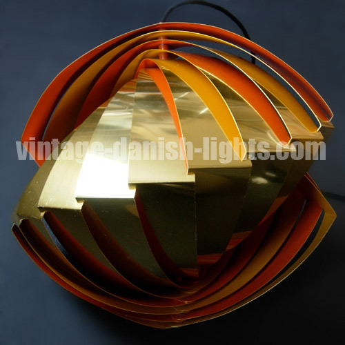
    In 1964/65 Konkylie was ready for the trees and for the wider market, which in subsequent years included the US, Iran and many other countries. It was produced in four colour schemes: the one originally devised for Tivoli, with gold-anodised exterior and interior lacquered in two shades of orange, and three new versions – two with silver-anodised exteriors Konkylie(one of which had a blues-and-red interior and the other a white interior), and a monochrome version in light grey.

    An aquaintance of Verner Panton later claimed that Konkylie had been copied from the Moon lamp. Weisdorf asked Danish lighting’s elder statesman Poul Henningsen whether he felt the claim was a fair one. The response was typical of PH: “I do not think that either of them are lamps; I would rather call them ladies’ hats,” he said. “But as ladies’ hats they are quite different.” With that endorsement, Weisdorf felt vindicated.

    It is unclear exactly how long the Konkylie remained in production and precisely how many were produced. But the light never sold in very large quantities, Konkyliebecause it was rather expensive to produce and Lyfa used it as a “prestige light” – as they did with other lights by Simon Henningsen and Louis Weisdorf – to promote sales of the company’s more traditional fixtures. A slightly modified version of the Konkylie was produced for a Japanese Tivoli park in 1996.

    The lights hanging from the trees in Copenhagen proved very long-lasting despite the outdoor conditions, and the last ones remained in place until quite recently. In the past decade interest in the Konkylie – and Louis Weisdorf’s other lights – has made a revival, with prices at auction and elsewhere rising steadily.

    © 2011 Sune Riishede and vintage-danish-lights.com. All rights reserved. This article is based on extensive correspondence between Louis Weisdorf and Sune Riishede and a personal meeting in November 2011 at the architect’s Copenhagen residence. The photo above right shows the 79-year-old Weisdorf in his studio with a multicoloured 3D computer model of the Konkylie. The article and its contents may not be copied or reproduced in any part or form without the prior written permission of the copyright holders. Links to http://www.vintage-danish-lights.com/the-lights-of-louis-weisdorf-konkylie-196465 are welcome.

  • More on the origins of the Søvaernspendel

    More on the origins of the Søvaernspendel

    A Danish reader, Harry Møller Nielsen, left a most interesting comment yesterday on our blog entry Jørn Utzon and the Søvaernspendel, one of two we wrote last December about the hotly debated question of the identity of the original designer of that much-loved Danish lamp (pictured below), the second entry being entitled More on Utzon and the Søvaernspendel.

    Sovaernspendel

    For the benefit of our non Danish-speaking readers, we have translated Harry’s fascinating comment into English:

    The Søvaernspendel was designed by a naval architectural firm in 1947. The head of the studio was an architect named Jens Klok, and his nephew Henning Klok, then a student of architecture, worked in the studio – and it was he who designed the Søvaernspendel. He later became a very talented architect, who as well as being Denmark’s first municipal employee housing councillor, also later became known for his chairs and tables.

    We were able to find two examples of Henning Klok’s later design work (images below) – the Flag Halyard chair and Vestervang Kirke in Viborg, designed with Poul Erik Jensen and built in 1970. If anyone can add any further information about Henning Klok, we’d love to hear it!

    Henning Klok chair

    Henning Klok church Viborg

  • Your favourite Louis Weisdorf light design

    Your favourite Louis Weisdorf light design

    It’s been some time since our last blog post, but we haven’t been idle in the meantime, and our main project has been to give our sister site Classic Modern a complete redesign and makeover. We’ve also been making progress on something that’s been bubbling away in the background for a couple of years now – a series of posts on the background to Louis Weisdorf’s lights. They will reveal many fascinating insights into the architect and his work, including which of his light designs is his own favourite. Meanwhile, we’d like to know what YOUR favourite Weisdorf light is. Vote in our poll below, and compare your choice with Weisdorf’s own when the profile is ready!

    Louis Weisdorf lights

    [polldaddy poll=5510807]

  • In memory of Claus Bolby (1944-2011)

    In memory of Claus Bolby (1944-2011)

    Today we heard the sad news that veteran Danish lighting designer and producer Claus Bolby, founder of Cebo Industri and creator of the popular acrylic light series Symfoni and Veega (pictured below), died last night after a long illness, his wife and lifelong business partner Jytte at his side.

    In memory of Claus Bolby by Sune Riishede

    Born in 1944, Bolby came to lighting design and production in his early 20s and remained active in the field until he became ill two years ago. He was not one to dwell on the past, and was amused to discover that his 1960s light designs had become popular collectors’ items and were undergoing a thriving trade in cyberspace. He and Jytte collaborated with vintage design dealer and journalist Sune Riishede to produce a profile of his 1960s and 1970s lighting for our sister site classic-modern.co.uk, which led shortly afterwards to a feature on Danish TV programme Hvad er det værd?


    For Bolby’s many friends, this clip offers some solace today, replacing the image of his painful battle with illness with a memory of the smiling and charismatic man amongst his colourful creations.

  • A tale of two Topans: the Pendant & the Spot

    A tale of two Topans: the Pendant & the Spot

    Verner Panton’s futuristic 1959 Topan light design for Louis Poulsen has rarely been out of the limelight in its more than 50 years of existence. Frequently copied and never out of style, the clipped sphere has stood the test of time and is an undisputed design classic.

    But how many people know that early versions of the Topan were divided into two models – the Topan Pendant (Topanpendel) and the Topan Spot (Topanspot), both available in a choice of polished aluminium or light grey? The difference between the two models was in the strength of the bulb they were designed to take, the Topan Pendant using a 75 watt bulb and the Topan Spot a 100 watt.

    Also largely forgotten today is the fact that both Topan models were available either with or without a metal grille to shield the bulb. Of the Topan models available in the mid 1960s, numbers 16570 and 16571 were Topan Pendants without and with grille respectively, while 16572 and 16574 were the Topan Spot equivalents.


    Verner Panton Louis Poulsen Topan light

  • Finn Juhl and the drivers of vintage value

    Finn Juhl and the drivers of vintage value

    The perceived value (and so the price) of a vintage Danish light is usually fairly closely related to its historical retail price. Broadly speaking, the more expensive the light originally was, the higher the value placed upon it today as a collector’s item. There are good reasons for this. The lights that were most expensive to buy in the 60s and 70s were those that were produced to the highest standards of quality and/or made from the most expensive materials and/or the most costly to develop and produce because of their complexity or the amount of manpower employed in the process. The high-quality design and production specifications of such lamps is what makes people prepared to pay higher prices for them today, just as it was when they were originally retailed.

    Finn Juhl light for Lyfa

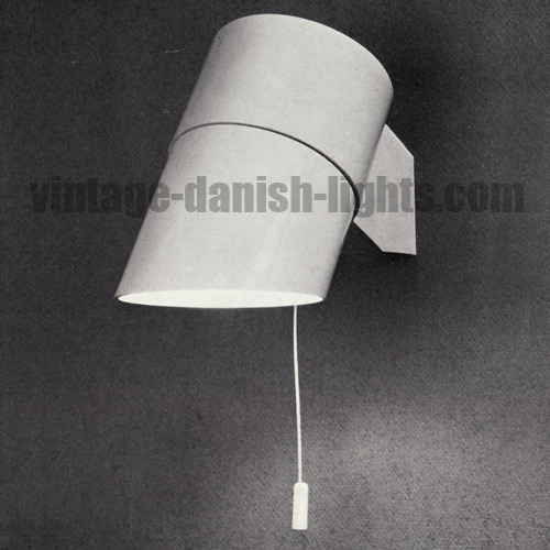
    There are, however, exceptions to this rule, which reveal some of the other factors driving vintage value. Finn Juhl’s mid-1960s Lyfa light is a good example. The design, with its tilting shade, was available in wall, table and pendant versions, the latter (pictured above) retailing at the end of 1966 for a mere 134 Danish krone for a 27cm diameter version and 150 kr for a 34cm version. At the same date, retail prices for other Danish lights included 395 kr for the Fog & Mørup Hekla, designed by Jon Olafsson & Petur B Luthersson, 439 kr for Fritz Schlegel’s Lyfa pendant, 236 kr for Verner Panton’s Moon pendant, produced by Louis Poulsen, and 333 kr for Poulsen’s PH table lamp, designed by Poul Henningsen.

    Today a collector might expect to pay something in the region of one UK pound for each krone of the original price for all the abovementioned lights – with the exception of the Finn Juhl, for which the asking price is likely to be closer to 10 UK pounds for each original krone.

    What lifts today’s price for this light so far above those of its contemporaries? The simple answer is its scarcity. It was not in production for many years and seems not to have sold in very large quantities, so supply today is very limited in comparison with some of the other lights mentioned – some of which are still being manufactured today. Meanwhile, Finn Juhl’s status as one of the great Danish designers and the fact that the Lyfa light is the only light he designed means that demand is high. Thus the intangible forces of demand and supply lift the price of the light onto a plane of its own. Unless, of course, someone discovers a huge cache of unsold stock in an old lighting warehouse.

  • Kastrup-Holmegaard’s Havanna series for F&M

    Kastrup-Holmegaard’s Havanna series for F&M

    The Kastrup-Holmegaard glassworks produced many different individually mouth-blown glass lamps for Fog & Mørup during the 1960s. Today the least well-known of these are the Havanna series, which emerged at the end of that decade. The range included the Jo Hammerborg-designed Cirkel, Radius and Dania and Bent Nordsted’s Kora, Sita and Rota.

    The feature that tied the series together was their smokey golden colour, entitled Havanna. It was, the advertisements explained, a brand new glass colour, specially developed after much experimentation by Kastrup-Holmegaard for Fog & Mørup. The golden tone, it was claimed, would light up a room with the same warm glow as a log fire, creating an atmosphere of cosiness and elegance, but without the discoloration of the surroundings that came with a fire.

    Havanna glass lamp by Kastrup-Holmegaard for Fog and Morup 1969

  • PH & Panton weren’t just good friends

    PH & Panton weren’t just good friends

    The family connection between two of the great Danish lighting designers is widely known – indeed, anyone who is aware of Simon Henningsen‘s work will almost certainly know that he was the the son of Poul Henningsen. But less well known is the fact that Verner Panton was also, by marriage, a part of the extended Henningsen family.

    Our story begins with the marriage of one Inger Andersen to dentist Otto Victor Kemp and the subsequent birth on 30 December 1928 of their daughter, Tove Kemp, on the Danish island of Fyn. Tove was born in Gentofte – a small town that was also the birthplace in 1926 of Verner Panton. Tove’s mother Inger later married Poul Henningsen, who thus became Tove’s stepfather. Tove grew up to be a music teacher, and in 1950 she married Verner Panton – making him PH’s son-in-law.

    Verner and Tove were divorced just three years later in 1953, but the warm relationship that existed between Panton and the Henningsen family endured. Panton was close to PH’s son Simon – Tove Kemp’s stepbrother, born in 1923 to PH’s first wife Elsa Strøjberg – and to Simon’s wife Bente, who worked for some time as Panton’s secretary. And as two of the most important lamp designers in Louis Poulsen’s history, Panton and PH had a strong professional connection and shared interest to add to their friendship and family ties. Both designed lights that are still in production at Poulsen today.

    Poul Henningsen, Verner Panton, Simon Henningsen

  • Jo Hammerborg: a man in the shadows

    Jo Hammerborg: a man in the shadows

    Jo Hammerborg joined Fog & Mørup as head of design in 1957 and retired in 1980, only a short time before both his own death and the demise of the company. The Hammerborg era was F&M’s most successful period – both creatively and commercially – as Hammerborg’s distinctively understated modernist designs and the unremittingly high standards of quality he imposed at the company won international acclaim and generated huge markets both at home and abroad. The sleek Hammerborg style spawned copies and lookalikes by the dozen, but none were able to attain the perfection in proportion or the unparalleled quality that are the hallmarks of a Hammerborg creation.

    Hammerborg’s prolific work rate generated an astonishingly wide catalogue of light designs, all of which have survived the test of time and look as fresh and compelling today as they did 40 or 50 years ago. They include the Alfa, Askepot, Beta, Central, Classic, Club, Corona, Cylinder, Dano, Diskos, Eiffel, Etna, Flet, Flora, Flora-Lite, Fuga, Golf, Heliotrop, Horisont, Hydra, Juno, Kardinal, Kastor, Kegle, Kubus, Life, Lotus, Medio, Metro, Milieu, Monolit, Nordlys, Nova, Optica, Orient, Pastel, Penta, Pisa, President, Poker, Pompei, Regent, Reijmyre, Roulet, Runda, Saturn, Sektor, Senior, Sera, Single, Skala, Studio, Tarok, Trombone, Tunika, Ultra, Variant, Vega, Zenith, Zero and Zone.

    Jo Johannes Hammerborg Fog and Morup head of lighting design 1957 to 1980

    This much we have been able to piece together. But beyond that – about the man himself – very little information is available. Who was Jo Hammerborg? We know that his full name was Johannes Hammerborg, that he was born in 1920 and died in 1982. Per H Hansen and Klaus Petersen’s Den Store Danske Møbelguide tells us that he trained in 1944 as a silversmith and subsequently studied at Copenhagen’s Art Academy before joining Georg Jensen to work as a silversmith from 1949 to 1957. Perhaps surprisingly, however, the 1966 special edition of Mobilia magazine that was entirely dedicated to a 100-year retrospective of Georg Jensen makes no mention of Hammerborg or his work.

    The only known photograph of Hammerborg is the one reproduced above, a tantalising portrait in which his eyes seem to pierce through the blurry image and speak directly to us. People who worked with Hammerborg at Fog & Mørup say he was physically small in stature – almost child-sized. But beyond that, it seems no one has anything to say, and although in the past decade his name has become a worldwide byword for innovative lighting design, there is no sign of any contribution to the global conversation about him from any spouse, children, siblings or other family members.

    Since those who knew him personally or worked with him will today be of a certain age, there is every possibility that they will take the information they hold with them to the grave, and their precious insights into this diminutive giant of lighting design may be lost forever. We therefore appeal to anyone who has even the smallest snippet of information to share it with us. Leave a response to this post, email us at info@vintage-danish-lights.com, or simply write it all down and give it to someone who will share it with the world for posterity.

  • Poulsen, Panton and the space programme

    Poulsen, Panton and the space programme

    In September 1972, journalist Bengt Rooke reported in Danish newspaper Ekstra Bladet that a 60-strong delegation of American architects and interior designers working on ideas for future space travel and living in space had consulted Louis Poulsen during a 14-day tour of Europe:

    A group of 60 American architects and interior designers are currently visiting London as part of a 14-day study and work trip. In Copenhagen yesterday they had a working meeting with Louis Poulsen A/S and the Association of Furniture Designers and Interior Designers of Denmark. The 60 American interior designers and architects are members of the American Institute of Interior Designers (AID), which is involved in numerous projects including the design of interior public spaces and architecture.
    One of the association’s major current projects is proposals for the interior residential environment of space stations, where scientists and researchers will be staying for up to 30 days at a time. Blanche F Start of Cambridge, Massachusetts, co-ordinates this project between the US Space Foundation, NASA and the AID.

    Rooke’s report was accompanied by a photograph of the meeting at Louis Poulsen’s Nyhavn offices with the caption: “From left, President of the AID, S Vinick, board member Norman de Haan and PR man Alfred J Siesel. The playing cards are made of new materials that cannot burn. Lamps, chairs, curtains, light table are Verner Panton designs.”

    Unfortunately the photo referred to by the caption is unavailable, so we are unable to know for sure which of Verner Panton’s lamps, chairs and curtains were presented to the space design team, but the final item mentioned – his light table for Louis Poulsen, the Ilumesa – is pictured below.

    Louis Poulsen Verner Panton Ilumesa light table

  • The price of a gold-plated Fog & Mørup Semi

    The price of a gold-plated Fog & Mørup Semi

    One of our readers has left a comment on the post we wrote recently about Fog & Mørup’s Golden Line, the range of 24-carat gold-plated versions of F&M’s Semi, Sektor and Milieu pendant lights. “I have [a Semi], which I call a trumpet lamp, with a diameter of 60cm in 24 carat gold. Can I get information about it and what price it was back then?” our reader asks.

    The first reference to a gold-plated version of the Semi appears in a Fog & Mørup advertisement in March 1976, reproduced in the image below, in which prices are listed as follows:

    Brown/red/white/black Chromium-plated 24-carat gold-plated
    Semi 38cm diameter Around 168 Danish krone 485 krone 585 krone
    Semi 47cm diameter Around 248 krone 609 krone 712 krone
    Semi 70cm diameter Around 631 krone 1,144 krone 1,317 krone

    Thus we can see that the gold-plated Semis were approximately 2.1 to 3.5 times as expensive as the ordinary coloured versions, the smaller ones being relatively more costly compared with their coloured counterparts than the larger sizes.

    For more information about the Semi generally, see our December 2010 blog post, The birth and afterlife of F&M’s Semi.

  • End of an era: the Divan 2 closes

    End of an era: the Divan 2 closes

    When Copenhagen’s Tivoli Gardens opens its gates on 14 April for the 2011 summer season, the doors to one of its oldest and most venerated restaurants, the Divan 2 (pictured below) – for which Simon P Henningsen created the glitteringly multifacted Divan 2 light – will remain closed. The restaurant went into voluntary receivership in January and will reopen in May under new management and with a new identity following an extensive refurbishment.

    Tivoli Gardens Divan 2 restaurant

    Danish lighting collectors can consequently expect to see a substantial influx onto the market of Simon Henningsen‘s dagger-edged pendant lights (pictured below en masse in the restaurant with their creator during their installation in 1962), though the restaurant’s receivers may attempt to maximise revenue by trickling the lights onto the market rather than attempting to dispose of them all at once. Either way, the restaurant’s demise provides a great opportunity for collectors but truly marks the end of an era.

    Simon Henningsen Divan 2 restaurant Tivoli Gardens

    Simon Henningsen Lyfa Divan 2 pendant light

  • The PH lighting manifesto part 2

    The PH lighting manifesto part 2

    Following on from last week’s post, which you can read here, we continue our translation of Bo Bedre’s November 1966 feature offering Poul Henningsen’s thoughts on lighting the home.

    Poul Henningsen by Jens Bull

    About lighting contrasts
    The eye cannot of course be prepared to respond at two levels of sensitivity at once. In a brilliantly lit kitchen, where the eye has adapted itself by closing down its response to light a little, it can be almost impossible to see what lies, for example, at the bottom of a deep, dark drawer. Thus it is much easier to see where the contrasts are not too great.

    About pale floors
    It is important to remember that light that falls down will diffuse up again in the form of glare from bright surfaces – pale floors or carpets, light table surfaces. It was bright fabrics that made sitting around the family table with a kerosene lamp so nice. A dark ceiling above, and pale floors and table surfaces beneath!
    Oh, certainly we have done the opposite for many years, but this is the right thing and the most comfortable.

    About dark walls
    In a dark room – with dark walls, furniture etc – you can make do with less light. It does not take much to provide adequate contrast. In a room with bright colours it takes relatively more light to achieve the same degree of contrast.
    Luminous efficiency consists of contrasts – if there were no contrast of things, one could not perceive them. But the contrast must never become so great that light dazzles.
    I once made a completely dark kitchen. We still have one today in our house. Not black now, but there is very dark woodwork and the counter top is laboratory stained. There’s not much light there, but it is good light. Warm light. There is no discomfort when you move your eyes from the intensely lit stove to the darker sections. And it keeps both food and cooking a good healthy colour.

    On the strength of lighting
    We must be careful not to fall into light addiction just because lighting equipment manufacturers increase the numbers in their tables year on year. Once it was said that a power consumption of 10 watts per square metre was sufficient. Now it is as high as 20 to 40 watts. In the lighting set-up in my own room I should I think have a total of 400 watts. I would rather have 250 watts, but my wife and I have agreed on 350 watts. This is equivalent to somewhere between 10 and 15 watts per square metre in large and small lamps.

    Large and small bulbs
    A 25 watt or 40 watt bulb gives a warmer and a more pleasant light than a 100 watt bulb. If you must use the whiter light of the larger bulb, you can place it behind a screen with warm colours – or you can make sure that the light falls on a surface – such as a table – with warm, light colours. The human eye is more familiar with the warm colours, and we thrive better with them.

    About lamps – and ladies’ hats
    There are unfortunately architects creating ladies’ hats instead of lampshades – and who have been happy to stretch an empty 10cm tin and call it a lamp. I wish that architects would think more about function than making “interesting” shapes.
    But that will probably only happen when the consumers themselves break out of their traditional perception of light and begin to make demands for quality on those manufacturers who are more or less forced to fabricate on demand.
    And that will happen only when consumers close their ears to the publicity drums, which have only the echo of the sales tills in mind.

  • Poul Henningsen’s lighting manifesto

    Poul Henningsen’s lighting manifesto

    In November 1966 Danish homestyle magazine Bo Bedre published a feature by Kirsten Bundgaard in which Poul Henningsen offered his thoughts on lighting in the home. We have translated these pearls of wisdom from their original Danish (below).

    Poul Henningsen by Jens Bull

    About the colour
    It is a misconception that artificial light must be an imitation of daytime sunlight, for it is not intended that day and night should be the same. We do not thrive on it.
    Admittedly, we have lights at night – we humans are frightened by total darkness. But when our forefathers huddled around the bonfire in the evening, it was for the heat, including the visually-perceived warmth of the fire flames, which provided security and protection against the darkness around it.
    Warm light changes the surroundings – the “cold” bluish colours are not as prominent. Man thrives better.

    About fluorescence
    The fluorescent tube is still, in its present form, a misunderstanding. Certainly it is strong: it casts bright light uniformly across the room. But it changes the surroundings in an erratic manner.
    Girls are not pretty in fluorescent lighting. However, they are lovely in the glow of an incandescent lamp or candles.
    Is there anything worse than coming into a house where the rooms are lit nicely, but a numbing light shock emanates from a pair of unforgiving fluorescent lights whenever the kitchen door opens? This is not a nice scenario for a family home!

    On the distribution of lamps
    Proper lighting is simply having as much (or as little) light as you need and feel comfortable with – and having it in the right places.
    You have to have many lights in a house, and you should feel a new lighting experience with each lamp. Lamps should be exciting.
    Light in a work area can obviously be brighter than elsewhere – but the rest of the room should not lie in the dark. There must still be small bright islands around, but with slightly more subdued areas in between.

    About as little light as possible
    The ugliness in the world is an over-lit space. Man cannot thrive in a sea of light, yet we are increasing the light-barbarism from day to day.
    This is probably because of the old fallacy that you see more and better in a room that is bright and dazzlingly illuminated. This is not, however, the case, due to the human eye’s ability to adapt. The eye automatically reduces its retinal sensitivity when exposed to strong light, whereas it becomes more sensitive in a subdued light.
    Sight does not improve because the illumination is increased – you just guard against the intense light by reducing the eye’s sensitivity. Think of the products that ancient craftsmen were able to make – small, meticulous things like filigree work – just by the glow of a candle…

    See next week’s post for part 2 of this feature.

  • Danlite Inc is Fog & Mørup USA

    Danlite Inc is Fog & Mørup USA

    From time to time it’s possible to find vintage lights by a Long Island, New York-based company called Danlite Inc being advertised for sale in the United States. These lights are, however, so obviously Danish in style that on one occasion a seller declared, “Do not be disillusioned by the Long Island NY address. Danlite Inc was a 100 per cent Danish firm that imported. Everything about it is Denmark.”

    In fact Danlite Inc was a US-registered subsidiary of Fog & Mørup (as the F&M catalogue card pictured below makes clear), and the lights it sold were straightforward Fog & Mørup productions with Danlite branding – a marketing move prompted perhaps by the difficulty many non-Danish speakers have in pronouncing the Danish brand name. This is a difficulty with which we sympathise: after 10 years of regular travel to Denmark to hunt for lights, our own sorry attempt (now sounding something like “Foh-oh-Moo”) still provokes widespread hilarity.

    Danlite Fog Morup

  • The Senior and the President

    The Senior and the President

    In the 1960s Jo Hammerborg designed two table lamps for Fog & Mørup which are easily and often confused. The Senior and the President (pictured in that order below) have much in common, but several differences distinguish them from one another. While both lamps have stems in either brass and teak or satinised aluminium and ebonised teak, the Senior’s stem is curved while the President’s is perfectly straight. And while the President’s shade is a single-layered affair matching its stem in brass or satinised aluminium, the Senior has a double-layered shade of opaline and olive green glass on the brass stem or opaline and lilac glass on the aluminium version.

    Jo Hammerborg Fog Morup Senior table lamp

    Jo Hammerborg Fog Morup President table lamp

  • Fog & Morup’s Chrome and Golden Lines

    Fog & Morup’s Chrome and Golden Lines

    We wrote in an earlier post (which you can read here) about cross-model colour coordination at Fog & Morup under Jo Hammerborg’s artistic direction through the 1960s and 1970s, which allowed the consumer to mix and match different models to harmonious effect in the home. Occasionally these coordinated productions were marketed explicitly as colour-based lines, the late 1960s Rainbow Line and White Line initiatives being the best-known examples.

    Much less well-known are the mid 1970s Chrome Line and Golden Line productions. Included in the Chrome Line were special chromium editions of the Fibonacci, the Semi and (pictured top below) the Bunker and the Poker, while the top-of-the-range Golden Line featured gleaming 24 carat gold-plated versions of the Semi, the Sektor and the Milieu (pictured in order below). The Golden Line, said the F&M publicity material, will be well suited as a refined detail in your home, where for example leather furniture and precious woods are used.

    Fog Morup Chrome Line

    Fog Morup Semi Golden Line

    Fog Morup Sektor Golden Line

    Fog Morup Milieu Golden Line

  • Jo Hammerborg’s rarest F&M light?

    Jo Hammerborg’s rarest F&M light?

    One of Jo Hammerborg’s earliest designs for Fog & Mørup is also perhaps his most rarely seen and least recognised F&M creation. The Kubus, pictured below in an F&M advertisement published in 1961 and in our own photos following the advert, is on a smaller scale than most Hammerborg lights, measuring just 22cm in height. The Kubus was available in orange, blue or cream.

    Jo Hammerborg Fog Morup Kubus

    Jo Hammerborg Fog Morup Kubus

    Jo Hammerborg Fog Morup Kubus

  • Hammerborg’s Tarok & the Schlegel lamp

    Hammerborg’s Tarok & the Schlegel lamp

    Fritz Schlegel’s classic bell-like light for Lyfa, the Schlegel-lampe, designed in 1938, inspired a number of similar designs with which it is often confused, including Jo Hammerborg’s Tarok for Fog & Mørup. The two lamps are pictured below, Hammerborg’s Tarok following the Schlegel-lampe and most easily distinguished from it by a diversion in the angle of the shade close to the outer edge.

    Fritz Schlegel lampe Lyfa

    Jo Hammerborg Tarok Fog Morup

  • Another diamond-shaped Preben Dal gem

    Another diamond-shaped Preben Dal gem

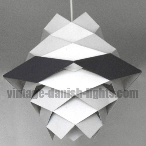
    Featured in Danish homestyle magazine Bo Bedre in January 1962 when his Symfoni (final image below) was already on prominent display in Copenhagen’s illustrious interior design store Illums Bolighus, this Preben Dal light is composed of the same diamond-shaped facets as the Symfoni, but the overall form is less complex. Both lights were produced by HF Belysning, aka Hans Følsgaard Elektro A/S. We have translated the Bo Bedre piece from the original Danish:

    Dip the light in soapy water and it is clean
    This light has several advantages. It is formed by rhomboid-shaped metal pieces that are welded together into pentagonal rings and then powder-coated white. All slats are vertical, so that there is good ventilation in the lamp, and the dust does not settle on them. One can easily lift the shade from its bracket and clean it – simply dip it into a bucket filled with detergent or soapy water. The lamp’s maximum width is 25cm, its height 23cm, and it can take bulbs of up to 100 watts. It costs 75kr with fitting and lead. Preben Dal for H Følsgaard.


    Preben

    Preben

    Preben

  • F&M wall lamp is Helth not Panton

    F&M wall lamp is Helth not Panton

    The owner of the pair of lights pictured below thought that they might be a rare wall-mounted version of Verner Panton’s Flowerpot. The Fog & Mørup labels present on the lights, however, reveal that there is no Panton connection – Panton never designed lights for F&M. Nor, indeed, was there ever any wall version of Panton’s Flowerpot, the light produced by Louis Poulsen in pendant, table and garden variations.

    Fog

    These lights’ actual identity is far more obscure, but in some ways just as interesting. The image below is a 1960s publicity shot from the time of the lamp’s introduction to the market by Fog & Mørup. Its name is Broby-lampe and its designer was one A Helth, about whom we know nothing and about whom we have been unable to find any information. If anyone out there can enlighten us, please leave a comment or email us at info@vintage-danish-lights.com.

    Fog

  • Poulsen’s IT lamp and the ghost of PH

    Poulsen’s IT lamp and the ghost of PH

    In view of their seminal influence both in Denmark and internationally, it is no surprise that Poul Henningsen’s ideas on lighting design were guiding the in-house design department at Louis Poulsen even long after his death in 1967. His legacy was explicitly acknowledged in the directly derivative PH 80, issued by Poulsen in 1974 as a posthumous tribute to the designer’s 80th birthday, and also in the IT desk lamp, designed by Poulsen’s in-house team led by Bent Gansel Boysen and introduced in 1972. An advertisement for the lamp dating from October that year ran as follows:
    So Poul Henningsen’s concept of a work light with an elliptical reflector has become reality. The elliptical form provides the best combination of maximum and evenly distributed light, and also creates a focal point, which can be very useful for demanding work or for the partially sighted.

    Louis

    Louis

    An additional feature of the IT lamp was the so-called 3-lys (3-light) system, first seen the previous year in the Verner Panton-designed Poulsen light the Panthella, whereby a single specially created bulb provided a choice of brightness settings – in the IT lamp’s case 40, 60 and 100 watts. The IT was available in matte black, matte white or chrome.

    Louis

  • Fog & Mørup lights in Brio miniatures

    Fog & Mørup lights in Brio miniatures

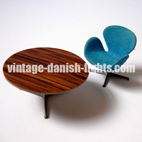
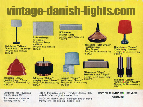
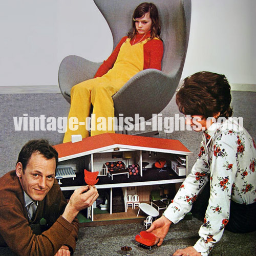
    In the early 1970s Swedish toy manufacturer Brio Scanditoy Mobilia produced miniature versions of some of the interior design classics of the day for use in furnishing their internationally popular dolls houses. Furniture by Arne Jacobsen featured prominently amongst these miniatures (see examples pictured below), but for lighting Brio turned to designs from Fog & Mørup, offering tiny versions of Jo Hammerborg’s Orient, Zone, Saturn and Zenith pendant lamps and his Orient table lamp and Pastel and Fuga wall lamps, along with Juel Nielsen’s Moon floor lamp and mirrored bathroom light and Kiel Jörgensen’s kitchen light.

    Brio

    Brio

    Brio

  • More on Utzon and the Søværnspendel

    More on Utzon and the Søværnspendel

    Following our recent piece on the debate about whether Jørn Utzon or the Danish Navy designed the Søværnspendel (which can be read here), we received an interesting email from Hans Marvell of &tradition, the current producer of the Utzon Pendel, the light now known as the Tivoli and pictured here with Utzon at his own home in an image reproduced from a 1955 issue of Møbler magazine.

    Nordisk

    With regard to the Søværnspendel debate, Marvell tells us that the Nordisk Solar Compagni production was the original, with the (now better known) Louis Poulsen version following later. He also confirms that Jørn Utzon was not the light’s designer, but makes the intriguing suggestion that Jørn Utzon’s father Aage may have had a hand in its creation. He writes:

    As far as we can work out, there is a good chance that either Jørn Utzon’s father or one of the other members of the navy’s technical office drew the Søværnspendel. Jørn Utzon’s father was a naval architect and his drawings and sketches are said to have laid the foundations of Utzon’s interest in architecture and design. The Søværnspendel predates the Tivoli pendant we make, and has been passed from one manufacturer to another. Initially produced by Nordisk Solar, the production was sold to Louis Poulsen, who took over all of Nordisk Solar’s consumer lamps. Today Nordisk Solar focuses on industrial lighting. Louis Poulsen made the Søværnspendel right up until the mid 1980s and it is found hanging in many public offices and schools in Denmark. A key thing to consider is that in the 1950s product names were still very uncommon. This is why both our Tivoli lamp and the Søværnspendel are difficult to research. However, I can confirm that according to the Utzon family’s knowledge, the Tivoli lamp from 1947 is the first acknowledged lamp designed by Jørn Utzon.

    Below: the Louis Poulsen version of the Søværnspendel
    Louis

  • Hvidt & Mølgaard’s F&M light design

    Hvidt & Mølgaard’s F&M light design

    Peter Hvidt (1916–1986) and his business partner Orla Mølgaard (aka Orla Mølgaard-Nielsen) (1907–1993) are best known for their furniture – in particular the Ax chair, designed in 1950 for Fritz Hansen, and the 1956 Boomerang chair for France & Son – but they also created lamps for Le Klint and Nordisk Solar Compagni.

    Less well known is the fact that they designed a light in the mid to late 1970s for Fog & Mørup. Entitled Dome and described by F&M at the time as “untraditional”, the lamp featured a translucent plastic globe with an aluminium shade in brown, red, yellow or white, and was intended for use in locations such as bathrooms and hallways.

    Fog

  • Jørn Utzon and the Søværnspendel

    Jørn Utzon and the Søværnspendel

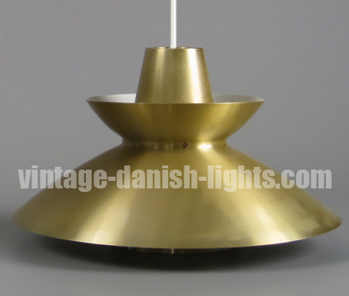
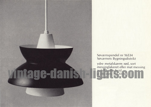
    The question of who designed the light known as the Søværnspendel has been the subject of much debate in recent years, with opinion divided between those who believe it to be a Jørn Utzon creation and those who say it was designed by the Danish Navy. The issue is complicated by the fact that there are three versions of the light – one produced by Louis Poulsen (first image below) and the other two by Nordisk Solar Compagni (second and third images below).

    Louis

    Nordisk

    Nordisk

    The Louis Poulsen production gives the light its Søværnspendel name by which both Poulsen and Nordisk Solar Compagni versions are generally known. Søværnspendel means Navy Pendant, and the designer of the Louis Poulsen Søværnspendel is listed in a 1967 catalogue as the Søværnets Bygningsdistrikt (Navy Buildings Department).

    Louis

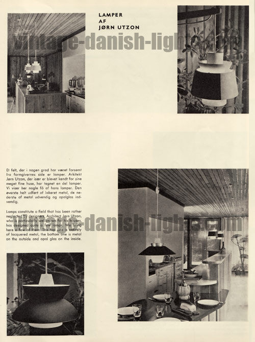
    It is the Nordisk Solar version to which Jørn Utzon’s name has often been attached, and the source for this attribution is usually given as a 1956 edition of Mobilia. Sure enough, the light appears in the July 1956 issue of that magazine, accompanied by the following text:
    Lamps constitute a field that has been rather neglected by designers. Architect Jørn Utzon, who is particularly well known for his houses, has designed quite a few lamps. We bring here a few of them. The top one is entirely of lacquered metal, the bottom one is metal on the outside and opal glass inside.

    Jorn

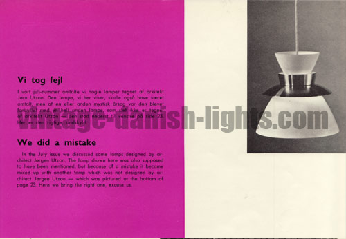
    However, this attribution is thrown into confusion by the August issue of the magazine, in an erratum entitled “We did a mistake”, which reads:
    In the July issue we discussed some lamps designed by architect Jørgen Utzon. The lamp shown here was also supposed to have been mentioned, but because of a mistake it became mixed up with another lamp which was not designed by architect Jørgen Utzon – which was pictured at the bottom of page 23. Here we bring the right one, excuse us.

    Jorn

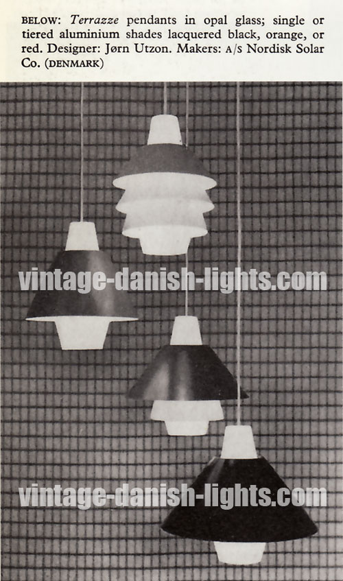
    Unfortunately it is less than entirely clear which of the two lights pictured at the bottom of the page in the July issue is being referred to in the erratum as “not designed by architect Jørgen Utzon”. We are left to draw our own conclusions. On the one hand, the July page referred to the “bottom” light as being metal and opal glass, which would indicate the lamp pictured to the bottom right. But while we at vintage-danish-lights.com are not familiar with that specific light design (see close-up view below), it looks as if it might be a member of the Terrazze family, illustrated in the 1958–1959 edition of The Studio Year Book of Furnishing & Decoration and reproduced in Taschen’s Decorative Arts 1950s (final image below).

    Jorn

    Jorn

    On balance, we tend towards concluding that it probably is the Søværnspendel that is being denied as an Utzon design. But if this is the correct conclusion, the question remains: who did design the Nordisk Solar Compagni light? Ulf Hard af Segerstad’s 1961 book Scandinavian Design tells us that Nordisk Solar Compagni’s lighting in the 1950s was designed by architects Max Bruel, Sven Middelboe and Jørn Utzon, and if Utzon is indeed ruled out, our money is on Sven Middelboe. If anyone can clear up this enduring mystery, we’d love to hear from them. Please leave a comment or email us at info@vintage-danish-lights.com.

    UPDATE: A Danish-speaking reader has kindly brought to our attention some subtleties in the Danish version of the Mobilia texts that have been omitted from the English translations printed in the magazine, and which confirm that the Søværnspendel is the lamp being referred to as not designed by Utzon. Our reader writes:
    Firstly, the Danish text on the first page says, “Den øverste helt udført af lakeret metal, de NEDERSTE af metal udvendig og opal glas indvendig”, which should be translated as, “The top one is entirely of lacquered metal, the BOTTOM ONES [ie, plural not singular] are metal on the outside and opal glass on the inside.” This means that the lamps that were planned to be illustrated were both made of metal and glass (like the lamp on the right), which the Søværnspendel is not, of course.
    Secondly the Danish text in the erratum states that the lamp which was not designed by architect Jørn Utzon “stod nederst til VENSTRE påe side”, which should correctly be translated as “was shown AT BOTTOM LEFT of the page”. This clearly means that it is the lamp to the left that is not designed by Utzon (ie the Søværnspendel).

  • The birth and afterlife of F&M’s Semi

    The birth and afterlife of F&M’s Semi

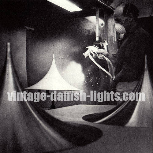
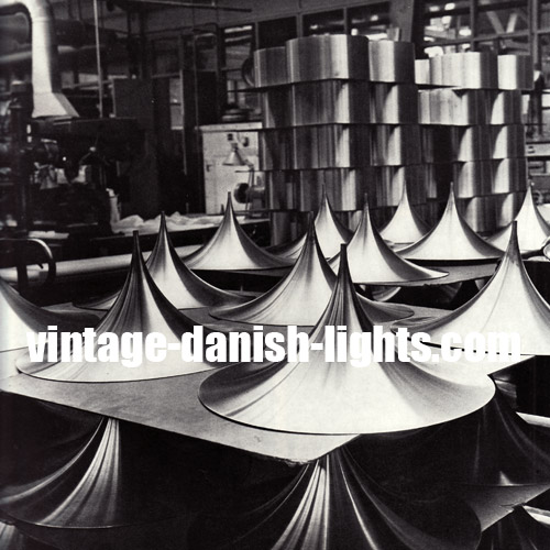
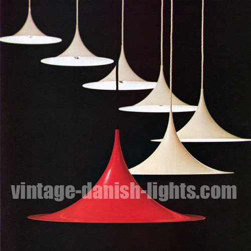
    Designed in 1967 by Claus Bonderup and Torsten Thorup when they were still students and put into production by Fog & Mørup, the Semi was an immensely popular light. An article in a 1973 edition of Mobilia magazine described the process by which each Semi was hand-produced at Fog & Mørup’s busy office-factory complex at Søborg on the outskirts of Copenhagen.
    A flat, lifeless sheet of metal is given one almighty thump on an automatic power press [pictured in the first image below], surface-ground to produce an absolutely smooth texture [second and third images below], spray-painted to ensure a superior finish [fourth image], and finally, stacked ready for packing [fifth image].

    Fog

    Fog

    Fog

    Fog

    Fog

    When the Fog & Mørup brand was discarded following the company’s merger with Lyfa at the end of the 1970s, the Semi was one of just a handful of F&M lights to remain in production, marketed under the Lyfa brand. After the merged Lyfa-Fog & Mørup was taken over by mass-market lighting producer Lyskaer in the early 1980s, production of the Semi continued under Lyskaer branding, and in the 1990s the light appeared under Horn Belysning branding when Lyskaer was taken over by that company. Horn was itself taken over in 2005 by Nordlux of Ã…lborg, where the Semi is not currently in production.

    UPDATE: An alert reader tells us that the Semi is currently in production by Copenhagen-based lighting producer Gubi. He also mentions having seen copies of the light by another manufacturer, which is a useful reminder that not everything that looks like a Semi is in fact a Semi. In a genuine Semi the lamp’s height exactly matches its radius (that is, half its diameter), and the diameter will be 38cm, 47cm, 60cm or 70cm. The only exception is the smallest Semi, a late 70s F&M production which has a diameter of 25.7cm and a height of 14.2cm, 1.35cm taller than it would be under the usual 2:1 ratio. Most unauthorised copies are foreshortened in the height proportion, possibly making them easier and therefore cheaper to produce but reducing the tapering elegance of their form.

    Fog

  • Frandsen’s Fibonacci needs clear bulbs

    Frandsen’s Fibonacci needs clear bulbs

    Danish architect Sophus Frandsen created the Fibonacci light, his timeless classic for Fog & Mørup, in the early 1960s. Despite being one of the company’s most expensive lights – the various versions costing from 10 pounds six shillings to 17 pounds seven shillings in the UK in 1963, when the average weekly wage was 20 pounds 16 shillings – it remained in production until F&M’s demise in the early 1980s. The light was awarded the gold medal at the Leipzig Messe in 1967 and was selected for inclusion in the show Die gute Industriform at the 1968 Hannover Messe.

    Fog

    Danish lighting designer Henrik Clausen presents a fascinating video profile of Sophus Frandsen at the Fagerhult Lighting Academy, which we have transcribed here:

    “I hope that I am not going to tell you anything here today that you don’t already know!” The person who said these words expected a lot from his audience. But at the same time he stepped down from the pedestal just by saying these words. For of course we all knew that we were listening to a real master in understanding light, lighting and lighting design. [Shows picture of Frandsen.] Here you see the person who made a big difference in my life. The picture is taken at Sophus Frandsen’s 80th birthday. He has become a living legend in the Danish lighting community. He had a lifelong position teaching light, lighting and lighting design at the Royal Danish Academy of Fine Arts in Copenhagen. I attended his lectures 25 years ago. He taught us about perspectives, and illustrated them with ancient Chinese arts. He showed that we feel less distance between mountains when the artist puts down cloud and mist. The clouds give a soft and diffuse light, and the artist often uses a cool and blueish light to create the feeling of distance. Nature clearly teaches us the same thing. The further away an object is, the more soft and blueish the light gets, and the mist or the low-hanging clouds diffuse and taint the light. It creates depth and perspective.
    Sophus often brought this old 6×6 light projector along. The light source is of course incandescent. Sophus would never use anything other than that, because he insisted on perfect colour rendering. Before he projected anything he made us watch the empty screen only showing a huge white square. Then he got out his slides. But his frames didn’t hold any beautiful pictures. They held all sorts of samples of clear glass used for window glazing – samples from all over the world made in different countries from different moulds. Glass is not just glass. Even clear glass changes the colour of the light. We looked at all kinds of different samples, sitting there watching the big square on the screen turn from white to soft blueish to green, and then you suddenly understood that light had to be treated with respect. And that’s exactly what Sophus did.
    When Sophus worked, there were no such things as lighting designers. Lighting was an integrated part of architecture. Nevertheless, Sophus was a true lighting designer – but most of all, he taught us all how to see. And for that I am forever grateful.


    Fog

    Clausen’s presentation provides an interesting context for the instruction in a late 1970s Fog & Mørup catalogue to fit clear (rather than opalescent) bulbs in Frandsen’s Fibonacci. The catalogue says:

    The Fibonacci is a lamp where the designer has done much work around the screening of the bulb, and the result is almost complete anti-dazzling in all directions. Fibonacci can therefore be suspended high or low as one prefers without dazzling, at the same time giving an even, diffuse illumination of the room. The light, airy design makes it suitable in almost any interior and for any style. For the Fibonacci lamp only clear bulbs should be used, as anti-dazzling and the right distribution of light can only be obtained with the correct bulb. The lampholder is adjustable to the various bulb sizes, so that the distance to the shades can always be correct.

    Fog

  • Nordisk Solar vs Anvia star lamps

    Nordisk Solar vs Anvia star lamps

    The star-shaped lacquered steel pendant light pictured below seems to embody the space-age style of the late 60s and early 70s, but in fact it was designed for Nordisk Solar Compagni at the beginning of the 1960s by Danish architects Niels Esmann & Hans C Jensen.

    Nordisk

    A news item in the October 1961 issue of Danish homestyle magazine Bo Bedre (illustrated with the picture below) reveals that the lamp’s 11 intersecting metal layers and the internal bracket holding them together would later become available as individual items, allowing the purchaser to build a lamp to their own height requirements – though we have seen no evidence that this feature was ever actually introduced.

    Nordisk

    The metal layers were available in white, grey, purple or orange, and at the time of the lamp’s introduction all had white interior surfaces, though this was subsequently changed to full colour throughout as seen in our own images (top and below).

    Nordisk

    The lamp is easily confused with another of very similar construction that was in production in Holland at around the same time. Usually attributed to JJM Hoogervorst for Anvia Almelo, the Dutch lamp can be distinguished from the Nordisk Solar version by the existence of a narrow metal rod attaching the bulbholder to the topmost metal layer. In the Nordisk Solar Compagni version this function is performed by a much wider metal bar (see image below), and the entire electric fitting slips freely in and out of the bar in the traditional Nordisk Solar style.

    Nordisk

    Furthermore, the Anvia versions usually have only nine layers, and sometimes seven, instead of the Nordisk’s 11 – though the possibility of other Nordisk combinations cannot be dismissed. But the clearest difference is that while the Nordisk lamp’s layers are of equal depth throughout, the Anvia layers are alternately thinner and wider – and the two widths are usually also different in colour.

  • Colour coordination in Danish lights

    Colour coordination in Danish lights

    In the late 1960s both Louis Poulsen and Fog & Morup launched lines of assorted lamp models in coordinated colours under unifying banners. In 1968 and 1969 Louis Poulsen’s Young Line embraced the company’s Combipendel, Søvaernspendel, Emaillearmatur, Billiardpendel and the Verner Panton-designed Topan and Flower Pots, and was offered in orange, red, turquoise, blue and (for some of the models) white.

    Louis Poulsen Young Line

    Louis Poulsen Young Line

    Fog and Mørup, meanwhile, launched its Rainbow Line (pictured below) in 1969, bringing together the Falcon, Juno, Zone and Equator in red, yellow, blue and white versions. This was closely followed by the White Line, a counterpoint to the vibrant colours of the Rainbow Line and marketed as “attractive, simple lights [that] can be used in almost any interior, irrespective of colour key or materials”.

    Fog

    The White Line (below) featured the Viking and Junior floor lamps, the Alpha and Corda wall lamps and the Lento table lamp, all of which had been produced previously in other colours or finishes, and the multi-haloed Hydra (centre top of picture), a new light in two versions which would only ever be produced in plain white.

    Fog

    The idea of cross-model colour coordination was in fact deeply embedded in Fog & Morup culture, and had long been pursued on an informal basis, with many lamp models in the early 1960s being produced in three separate metal finishes – aluminium, brass and copper – allowing the customer to choose different models for different areas of the home and still achieve a harmonious look throughout (see, for example, the Lento and Orient table lamps and the Nova pendant light, pictured in the following three images).

    Fog

    Fog

    Fog

    Indeed, colour coordination across models was a permanent feature of the F&M landscape during Jo Hammerborg’s reign as director of design through the 1960s and 1970s, the unifying colours changing over time as tastes and fashions altered. The mid to late 1970s, for example, saw F&M models including the Poker, Arabia, Pfister (first image below), Contact (second image below), Bunker, Flora, Markise and Aktiv being offered in various combinations of that period’s key colours of yellow, orange, red, brown, green and white.

    Fog

    Fog

  • PH 80 is not a Poul Henningsen design

    PH 80 is not a Poul Henningsen design

    It is easy to understand why the claim is often made that Louis Poulsen’s PH 80 table and floor lamps were designed by Poul Henningsen himself. But they were actually designed by Bent Gantzel-Boysen and issued by Louis Poulsen in 1974, some seven years after Henningsen’s death, as a tribute to Henningsen marking his 80th birthday. We have translated a report that appeared in the November 1974 issue of Denmark’s Bo Bedre magazine:

    Recently Poul Henningsen would have reached 80 years of age, and on this occasion Louis Poulsen & Co A/S issued a new table and floor lamp. It is called PH 80 and has been designed by Bent Gantzel-Boysen to follow in the footsteps of PH’s famous lamps. The new PH lamp absorbs more of the bulb light than its predecessors – because the shade here is of white acrylic, not metal. But it is just as reflective and gives a light as uniformly bright as PH’s own lamps. The distribution of light can seen in the graph below, in which the measured brightness in all directions has been plotted every 10 degrees. As can be seen, the lamp gives a very bright light and even coverage over a fairly large field.

    Louis

  • The forgotten art of Oluf Gravesen

    The forgotten art of Oluf Gravesen

    Danish advertising for items of domestic design in the 1960s and 1970s often followed a very specific format. The featured product would be photographed in a room setting together with items by other manufacturers that were generally considered to be amongst the most prestigious and desirable designs of the time. These secondary items were not identified in the advertisement and were not themselves being promoted; rather, their presence was intended to signal the prestige and desirability of the advertiser’s own product.

    Fog

    Thus Fog & Mørup, Lyfa and Louis Poulsen lights featured in many different furniture producers’ room settings, the example above being an advertisement for Ryesberg Møbler chairs by Illum Wikkelso (featuring the F&M Formland), and the following three being for G Thams-designed seating at Vejen Polstermøbelfabrik (first with the F&M Milieu and Verner Panton’s Topan for Louis Poulsen, and then with Lyfa’s Konkylie) and a Matador sofa group at Eran Møbler (with the F&M Hekla).

    Fog

    Lyfa

    Fog

    Conversely, furniture by manufacturers including Fritz Hansen, France & Son, Getama and the like often formed the background room setting for Fog & Mørup’s own advertisements. Most of the items that were called into action for this supporting role are easily identified today, but an exception exists in the case of an artist called Oluf Gravesen, whose artworks were employed by Fog & Mørup and others. Gravesen’s work went unrecognised in this context for decades until it was spotted recently by our friend and research collaborator Sune Riishede in two late 60s images – one an F&M Diskos advert and the other a picture of a Danish Furniture Manufacturers’ Association display at the London Earls Court International Furniture Show (both reproduced below).

    Oluf

    Oluf

    Sune had become close friends with Oluf Gravesen when both moved to Copenhagen after being at boarding school together in the late 1950s. In 1961 the 18-year-old Gravesen became the youngest person to be admitted to the Danish Royal Academy’s Spring Exhibition at Charlottenborg, exhibiting three small scrap metal reliefs. A successful solo exhibition at Den Permanente in the mid-60s brought his work to the attention of Copenhagen’s stylists and led to its inclusion in room settings such as those above. Later he worked on his artworks, all made entirely of nails, in Paris, London and New York. Gravesen’s exile meant he was not widely known in Denmark, so when he returned home from New York in the mid-1980s with a deadly disease, his tragically premature death was marked only by his family and closest friends and came, in the words of Pittsburgh’s Concept Art Gallery, “before he could see the influence his work would have on the late 20th and early 21st century New York art scene”.

    Oluf

    Photograph of Oluf Gravesen reproduced by kind permission of Ray Dean


    UPDATE 26 December 2011: Our sharp-eyed friend Sune Riishede has spotted another of Oluf’s artworks, this time featuring in a 1966 Fog & Mørup advertisement for Jo Hammerborg’s Trombone table lamp. Sune tells us: “I remember that Oluf had a short period in the early 1960s where he would penetrate a thin metal sheet with nails to create a landscape of holes, and also to hammer a shape in the metal surface. I imagine that this one belonged to interior designer Bent Kilåe’s collection, since I never saw those works again.”

    Oluf

  • F&M Karlebo is not a PH series light

    F&M Karlebo is not a PH series light

    We have seen the light pictured in the first image below described as being a PH series lamp, designed by Poul Henningsen and made by Louis Poulsen. We have also seen it described as a Falcon, designed by Andreas Hansen and made by Fog & Mørup. But while the light does bear quite some resemblance to the Falcon (pictured in the second image below) and was indeed produced by Fog & Mørup, it is actually entitled Karlebo and was designed by Hans Hartvig Skaarup and Marinus Jespersen, two Danish architects who founded a design and urban planning studio together in 1953. A 1970s Fog & Mørup advertisement for the Karlebo described the lamp as being a big, sturdy light suitable for hanging over working and dining tables. “However”, the advert continued, “as a general light hung close to the ceiling, Karlebo is a splendid fitting, as the shade system prevents the lamp from dazzling at annoying angles.”

    Fog

    Fog

  • F&M Hekla’s fiery Icelandic connection

    F&M Hekla’s fiery Icelandic connection

    It is widely known that Fog & Mørup’s mid-1960s Hekla pendant light was created by two furniture designers from Iceland, Petur B Luthersson and Jon Olafsson. The prize-winning Hekla proved enduringly popular and remained in production at Fog & Morup for 15 years to the end of the 1970s.

    Less well known is the Icelandic connection in the lamp itself, which shares its name, domed shape, fiery core and (in winter months at least) colour with one of Iceland’s most active volcanoes – a 1,491-metre stratovolcano situated towards the south of the country.

    Hekla stratovolcano in Iceland

    Hekla stratovolcano in Iceland

    Fog Morup Luthersson Olafsson Hekla pendant light

  • More on Coronell v Hans-Agne Jakobsson

    More on Coronell v Hans-Agne Jakobsson

    Our previous blog entry on the common but incorrect attribution to Hans-Agne Jakobsson of a range of prism lights which were actually produced by Danish company Coronell (which you can read here) was picked up by Swedish blog Wanjasvarjehanda. Wanja, the writer of the blog, added that a friend of hers had referred her to the January 1968 issue of Mobilia magazine, in which a report on the 1967 Scandinavian Lighting Fair in Gøteborg revealed the name of the person who actually did design the Coronell lights. A photo showing several of the lights (reproduced below) was accompanied in the magazine by the following caption:

    Metal shades with inlaid prisms of different colours. Designer and producer: Werner Schou, Coronell Electro A/S, Denmark.

    Wanja followed up the lead and discovered that Werner August Hugo Schou was the owner/board member of Coronell Electro A/S, which was set up in Hellerup, Denmark, on 24 August 1964 and wound up on 6 December 1991, and also of Coronell Lampe ApS, set up in Birkerød on 1 January 1979 and wound up on 31 July 1998. Nice work, Wanja!

    Coronell prism lights Werner Schou

  • Hans Due’s Optima was white at launch

    Hans Due’s Optima was white at launch

    Bengt Rooke’s Tidsfasetter, a collation of vintage Scandinavian art and design news, includes an item that appeared in Denmark’s Ekstra Bladet newspaper on 19 October 1972, reporting on the launch at Fog & Mørup’s Copenhagen showroom of Hans Due’s Optima series of lights:

    Industrial designer Hans Due’s new lamp series Optima was launched yesterday at Fog & Mørup on Amagertorv. It consists of seven models: three pendant lamps with diameters of 20, 50 and 60cm, two floor lamps with one and two spots respectively, a table lamp, and a wall lamp. The shades on the wall, table and floor lamps can be adjusted in all directions, and all models are painted white, with metal parts in matte chrome. An inner reflective screen on the pendant versions means the lamps provide even, glare-free lighting in both high-hanging and low-hanging situations. The lamps have aroused considerable international interest at several fairs, so that production is only now available to be presented to the Danish market.

    Two interesting points arise from this report. One is the fact that the Optima range was initially presented in white versions only. This is confirmed by a Fog & Mørup advertisement published the same month, October 1972, which begins, “Optima is a new lamp series in matte white, with matte-chromed metal parts.” Tracking the series via the price lists that F&M issued on a regular basis to retailers reveals that it was extended to include the yellow and brown versions in late 1973, thus completing the range around a year after its launch.

    The second point of interest is that the series included a now little-known wall light. This elusive member of the Optima family is nowhere to be seen in the images accompanying F&M’s launch advert (reproduced below), but eventually made a rare appearance, in yellow, in a November 1974 F&M advert (final image below, bottom left corner).

    Fog and Morup Hans Due Optima lamp series

    Fog and Morup Hans Due Optima lamp series

    Fog and Morup Hans Due Optima lamp series

  • How F&M’s Formland avoids dazzle

    How F&M’s Formland avoids dazzle

    An early 70s edition of Design from Scandinavia reveals the material that architects Sidse Werner and Leif Alring used to create the light-transmitting but non-dazzling domed tops of their Formland lamp series for Fog & Morup (pictured below):
    The metal parts of the fittings are lacquered in white, red, turquoise or yellow, and the shining calotte is made of buturate [aka butyrate], the only material that permits one to look at the filament of the bulb without being dazzled by it.

    The Polymer Plastics Corporation explains what butyrate is:
    Butyrate is a cellulose ester modified by using butyric and acetic acids, producing cellulose acetate butyrate, or CAB. Unlike other common synthetic plastics, the cellulosic plastics are not manufactured by polymerising a monomer. Instead, they are produced by the chemical modification of cellulose, a natural polymer. Cellulose itself is not a thermoplastic, since it will not melt. Yet by the viscose process, it is made into film (cellophane) and into fibre (rayon) that compete with the products of its thermoplastic derivatives.

    Cellulosics as a group are characterised by good strength, toughness and high surface gloss. In addition, they have good chemical resistance, good clarity, sparkle, and will take decoration readily. CAB is tougher than acetate and has lower moisture absorption. It resists weathering and has excellent transparency. Although it is adversely affected by alcohol, alkalis, paint removers and acetones, it is resistant to most household chemicals. Additionally, CAB is resistant to the harmful effects of ultraviolet radiation.


    Fog and Morup Sidse Werner Leif Alring Formland

  • Quality System – back from obscurity

    Quality System – back from obscurity

    From its inception in 1965 until its demise in 1985, Danish lighting company Quality System was hugely successful, and its products, designed by artist Flemming Brylle and industrial designer Preben Jacobsen, sold in the millions. For the next two decades, however, the company’s name was all but forgotten, due partly to the fact that its products – mostly self-assembly plastic lamps – carried no branding except on their packaging, which would tend to be discarded once the light was assembled.

    Even the company’s metal-bodied Moon Light, which continues to pop up from time to time, never seems to have any labels attached and is thus usually unrecognised, sellers often simply describing it as being “like a Panton Flowerpot”. The lack of trace left by the company was exacerbated by the apparently low profile it kept in advertising. A rare 1970 Quality System advertisement, reproduced below, offered the following information about the company’s products:

    Some of Denmark’s best-selling lights, familiar in most parts of the world, can now be ordered direct to your home. Lights that can be assembled in a very short time, manufactured in antistatic polyacrylic – a material with very fine light-dispersing qualities that is also easy to clean. These 10 lamps (from a total of 63 different models) have been created by famous designers, and fit perfectly into today’s residential milieu. New lighting throughout the home straight to your door.

    Quality System vintage Danish lights

    Quality System vintage Danish lights

    (1) Cosmo Lights, (2) Confetti Light, (3) String Light, (4) Moon Light, (5) Twin Light, (6) Fleur Light, (7) Easy Light, (8) Classic Light, (9) Hi-Light, (10) Twister, (11) Moon Lights.

    In 2003, astonished at the exorbitant prices they saw vintage Quality System lights being sold at, Brylle and Jacobsen re-established the company and began producing new retro-style designs, meeting once again with immediate global success and selling more than half a million units in the first six months of operation.

  • The mysterious Danish star light

    The mysterious Danish star light

    One of the many vintage Danish lights we count among our favourites is the large (50cm diameter), heavy (3kg) and fearsomely spikey star-shaped fixture pictured below. But its origins are an enduring mystery to us. Over the past decade we have seen examples of the light with apparently genuine Lyfa labels and others with Nordisk Solar Compagni ones. This is not in itself a great surprise, as we know that both these companies occasionally lent their branding to lamps that were actually produced by third parties – independent manufacturers like Claus Bolby, for example.

    But if both sets of labels are indeed genuine, who was that unacknowledged third-party producer? And who was the designer? We have seen various claims in regard to the latter role over the years, among them Alfred Homan, Anton Holm, Alfred J Andersen and Simon P Henningsen, but none of these have been backed up with any primary-source evidence, and the profile of Simon Henningsen on our sister site classic-modern.co.uk clearly rules him out. We’d love to hear from anyone who has any reliable information about this light – please email us at info@vintage-danish-lights.com.

    UPDATE NOVEMBER 2012: Click here to read how we discovered the answer to this mystery.

    Vintage Danish modern star light

  • Weisdorf’s Konkylie was made for trees

    Weisdorf’s Konkylie was made for trees

    Louis Weisdorf’s extraordinary Konkylie (“conch shell”) light was originally designed for Copenhagen’s Tivoli Gardens, where it hung from trees in glorious fiery clusters. Like Simon P Henningsen’s Divan 2, also designed for Tivoli, the Konkylie was subsequently put into general production by Lyfa. Already confident of its enduring appeal, a 1967 Lyfa advert described the Konkylie in the following terms:

    Louis Weisdorf MAA is a young architect with a strong sense of form. With his creative and technical understanding, he has designed a series of lights for Lyfa – the Konkylie lamps, available in “silver” or “gold”. A truly fascinating light, which will one day become a classic.

    Louis Weisdorf Lyfa Konkylie lamp

  • Piet Hein’s 1969 Ra lamp for Lyfa

    Piet Hein’s 1969 Ra lamp for Lyfa

    Bengt Rooke’s Tidsfasetter, a collation of historical art and design news items from Scandinavia, includes a 1969 clip entitled Piet and Lux and Lyfa, which reports on the innovation behind Piet Hein’s Ra lamp design for Lyfa (pictured below). Here is our translation:

    Piet Hein, the Dane who has achieved world renown as a theorist, inventor and poet, has created a new lamp for Lyfa A/S. Piet Hein calls his lamp the Ra lamp, after the ancient Egyptian sun god. The Ra lamp has been introduced both in Denmark and in the international market, and is based on a new Piet Hein discovery – isoluxfladerne – which basically is a way of providing as much regular light as possible without dazzle. After Grooks and Superelipses and much more, Piet Hein now offers us a bright new light.

    We have not translated the Danish term for Piet Hein’s discovery isoluxfladerne, not least because we couldn’t come up with a neat equivalent in English. The word has three components, the first of which – iso – is derived from the Greek word isos, meaning equal. The second component – lux – is the SI unit of illuminance, equal to one lumen per square metre, and more generally means luminescence or simply light. The third component – fladerne – is Danish for surfaces. Piet Hein’s innovation in the Ra lamp is thus, as described in the clip, the illumination of surfaces in an even (and non-dazzling) manner.

    Piet Hein Lyfa Ra lamp

  • Verner Panton’s Panthella/3-light

    Verner Panton’s Panthella/3-light

    When people come across a vintage Panthella for the first time they often think there’s something wrong with the on/off switch. “It’s not working properly”, they say. “I have to step on it twice to bring the light on, and twice again to turn it off.”

    In fact, the four-step Panthella switch is a feature and not a bug! While later productions of this classic Verner Panton lamp have a standard two-step on/off switch housed a little way along the electric cable, the switch in the original design was a small button elegantly incorporated directly into the curve of the base, and its complex functioning was a key feature of the lamp.

    Indeed, the lamp was introduced by its producer Louis Poulsen in 1971 as the Panthella/3-lys (Panthella/3-light). It required the use of a specially-designed bulb – hence its apparently strange behaviour when a standard bulb is used. A Poulsen advertisement, which we have translated from the original Danish, described the lamp as follows:

    Verner Panton has created a new lamp. We’ve called it Panthella/3-light. It is no ordinary lamp, because with only one filament it has three levels of intensity: 60, 100, 160 watts. You press the button – with the hand or a foot – one, two or three times. Fourth time off. It’s quite simple. Panthella 3-light is not only new technology, it is functional design, and is simple and beautiful in form. Panthella is made of white plastic, so is easy to move around. The low Panthella is 68cm high, and many will use it as a table lamp. The high Panthella is 120cm tall, and designed to stand on the floor.

    Verner Panton Louis Poulsen Panthella

    Verner Panton Louis Poulsen Panthella

    Verner Panton Louis Poulsen Panthella

    Verner Panton Louis Poulsen Panthella

  • Jo Hammerborg’s Saturn series

    Jo Hammerborg’s Saturn series

    One particular group of Fog & Mørup lights by Jo Hammerborg – which for convenience here we will call the Saturn series – embodies Hammerborg’s most easily recognised and most widely imitated design concept.

    Jo Hammerborg Fog Morup Saturn Tunika Juno

    The basic Saturn series concept was a structure of two concentric cylindrical bands, and Hammerborg explored this form in many varying proportions of height and width. Early 1960s examples, mostly in copper and black laquered metal, included (pictured above left to right) the Saturn itself, the Tunika and the Juno, the Dano (pictured below) and the Eiffel (pictured following the Dano).

    Jo Hammerborg Fog Morup Dano

    Jo Hammerborg Fog Morup Eiffel

    Other examples included the Etna, the Zenith, and the Corona – in which the core became conical in form instead of cylindrical. Variations in colour extended as far as the bright single-coloured Rainbow Line Junos of the late 60s and early 70s, and the concept remained one of Hammerborg’s signature themes throughout his two decades of design work at Fog & Morup.

  • Coronell, not Hans-Agne Jakobsson

    Coronell, not Hans-Agne Jakobsson

    It has been brought to our attention that, in one of the misinformation feedback loops so common on the internet, sellers on Swedish auction site tradera.com have been in the habit of describing the lights pictured below as the work of Sweden’s Hans-Agne Jakobsson.

    Coronell pendant lights

    Coronell pendant lights

    Coronell pendant lights

    In fact all these lights were made in the 1970s by Coronell of Denmark. The February 1973 catalogue in our possession gives the titles and dimensions of the lamps as follows. Top picture, left to right, P12 PB2 (diameter 12cm, height 19cm), P112 PB2 (diameter 20cm, height 29cm). Middle picture, clockwise from top left, P33 PB2 (diameter and height 40cm), P26 PB2 (diameter and height 24cm), P32 PB2 (diameter and height 30cm), P14 PB2 (diameter and height 16cm). Bottom picture, clockwise from top left, P15 PB3 (diameter 13cm, height 17cm), P24 PB3 (diameter 21cm, height 25cm), L21 PB3 (diameter 17cm, height 25cm).

  • Fog & Mørup’s 1969 Rainbow Line

    Fog & Mørup’s 1969 Rainbow Line

    In 1969 four Fog & Mørup light models – Andreas Hansen’s Falcon and Jo Hammerborg’s Juno, Zone and Equator – were brought together in vibrant red, yellow, blue and white versions to form the Regnbue Linie (Rainbow Line) series.

    Fog Morup Rainbow Line

    The conical Zone was the only completely new issue in the series, the Equator having been available since the previous year, while Hansen’s Falcon had been around in muted two-tone versions (pictured below) for some five years, and Hammerborg’s Juno – the oldest member of the Rainbow Line series – had first appeared in the early 1960s as part of an extensive line of copper and black lights with a shared banded shape in varying proportions of height and width which included the Saturn.

    Fog Morup Andreas Hansen Falcon

  • ‘Tivoli’ wall light is by HS, not SH

    ‘Tivoli’ wall light is by HS, not SH

    The designer of the diamond-shaped wall light pictured below is often said to be Simon P Henningsen. Both this raw metal version and another lacquered in black and white are, it is claimed, entitled Tivoli and were produced by Lyfa. But all three of these assertions are actually incorrect. The wall light is in fact by Holm Sørensen, the company founded by Sven Aage Holm Sørensen to produce his own designs. The light designed by Simon Henningsen, produced by Lyfa and popularly known as Tivoli (though its proper title is Divan 2, after the name of the restaurant in Copenhagen’s Tivoli Gardens for which Henningsen created it) is pictured beneath the Holm Sørensen light. (Holm Sørensen image courtesy of Sune Riishede.)

    Holm Sorensen diamond-shaped metal wall light

    Lyfa Simon P Henningsen Divan 2 Tivoli light

  • Jo Hammerborg’s Penta is not a PH 4/3

    Jo Hammerborg’s Penta is not a PH 4/3


    The Penta, pictured below, is a little-known Fog & Morup light designed by Jo Hammerborg and first appearing in the record in 1965. More traditional in form and rounded in shape than most other Hammerborg designs of the period, the light is rarely recognised for what it is and is frequently attributed to Poul Henningsen for Louis Poulsen, often being mistaken specifically for Henningsen’s PH 4/3, pictured in orange here following the lilac Penta.

    Fog Morup Jo Hammerborg Penta

    Louis Poulsen Poul Henningsen PH 4-3

  • 13 of 100 great Danish designs of 1974

    13 of 100 great Danish designs of 1974


    In 1974 a special edition of Mobilia magazine was dedicated to showcasing, as the title of the issue announced, “One Hundred Great Danish Designs!” The 100 featured products were chosen as “up-to-the-minute examples of Danish industry”. “Each of these products,” the magazine’s editorial explained, “in its own way and on its own terms combines reasonable proportions of economy, function and aesthetics.”

    Nordisk Solar Compagni Sven Middelboe Night-cap

    Among the 100 products were 13 lights: Sven Middelboe’s Night-cap for Nordisk Solar Compagni (pictured above), and, in order of appearance below, Jørgen Gammelgaard’s Tip-top for Design Forum A/S, two Fog & Mørup lights – Claus Bonderup & Torsten Thorup’s Semi and Peter Avondoglio’s Contact, the Fruit lamp by Kaare Klint for his brother Tage’s company Le Klint, Louis Weisdorf’s Turbo for Lyfa, Verner Panton’s Panthella for Louis Poulsen, and Poulsen’s in-house design the Unispot. Also among the 13 (but not pictured here) were G Biilmann Petersen’s Le Klint table lamp and another four Louis Poulsen lights – Poul Henningsen’s PH 5, Kontrast and PH 80, and Jens Møller-Jensen’s Albertslund outdoor lamp.

    Jorgen Gammelgaard Tip-top Design Forum

    Fog Morup Semi Claus Bonderup Torsten Thorup

    Fog Morup Contact Peter Avondoglio

    Kaare Klint Fruit lamp Le Klint

    Louis Weisdorf Lyfa Turbo

    Louis Poulsen Verner Panton Panthella

    Louis Poulsen Unispot

  • Secret treasure in the F&M Orient

    Secret treasure in the F&M Orient

    Few people know that when Jo Hammerborg‘s Orient pendant light first appeared on the market in the early 1960s, the range included a version of the Orient Minor (far left in the picture below) made of solid sterling silver and retailing at more than 10 times the price of other lamps in the line.

    Jo Hammerborg Fog and Morup Orient

    An April 1963 Fog & Morup catalogue lists the complete Orient range with prices in Danish kroner (Dkr), US dollars (USD) and UK pounds (GBP in pounds, shillings and pence) as follows:

    Orient Minor (diameter 22.5cm, height 25cm)
    E 2358/40 Copper Dkr 84.00 USD 12.25 GBP 4.7.0
    E 2360/80 Aluminium Dkr 65.25 USD 9.45 GBP 3.7.6
    E 2360/84 Anodised brown Dkr 71.50 USD 10.35 GBP 3.15.0
    E 2360/85 Anodised slate Dkr 71.50 USD 10.35 GBP 3.15.0
    E 2363 Sterling silver Dkr 866.00 USD 125.70 GBP 44.15.0
    Orient Major (diameter 38cm, height 34cm)
    E 2359/40 Copper Dkr 134.50 USD 19.50 GBP 6.19.6
    E 2361/80 Aluminium Dkr 84.00 USD 12.25 GBP 4.7.0
    E 2361/84 Anodised brown Price not given
    E 2361/85 Anodised slate Price not given

    Jo Hammerborg Fog and Morup Orient

    There is, however, no sign of either the sterling silver or the anodised metal variants in a 1965 advertisement for the Orient (pictured above), and no mention of them in any subsequent F&M catalogues or advertisements in our possession. While the copper and aluminium versions of the Orient remained in production in both Major and Minor sizes until at least 1974, the anodised metal and solid silver editions never appeared again.

  • The spiral that isn’t a Lyfa Weisdorf

    The spiral that isn’t a Lyfa Weisdorf

    From time to time we see one or other of the two spiral-structured lamps pictured below being attributed to Louis Weisdorf for Lyfa. Usually in these cases no title is given for the light, but occasionally it is claimed to be a Konkylie or a Turbo.

    Henri Mathieu Lubéron Applique Apt

    Henri Mathieu Lubéron Ventoux

    In fact, neither of the lights was designed by Louis Weisdorf or produced by Lyfa. Both lights are the work of French designer Henri Mathieu. Dating from 1970/71 and back in production today, the pair are part of the collection Lubéron and are entitled Applique Apt and Ventoux respectively. Weisdorf’s Konkylie and Turbo are pictured below for comparison, the former being most easily distinguished from the Mathieu pair by its sharp angles.

    Louis Weisdorf Lyfa Konkylie

    Louis Weisdorf Lyfa Turbo

  • Jo Hammerborg’s earliest F&M designs

    Jo Hammerborg’s earliest F&M designs

    When Jo Hammerborg joined Fog & Mørup in 1957 he lost no time in transforming the company’s product range and bringing it firmly into the modern age. Out went the cumbersome chandeliers with their glass shades resembling fried eggs, and in came a swathe of sleek, minimal and modern designs that were produced to the highest possible standards of quality.

    Jo Hammerborg Fog Morup Corona

    By as early as April 1963 the company’s catalogue of 40 different lines included 24 designs by Hammerborg himself, every one of which has withstood the harsh test of time and continues to look fresh nearly 50 years on. These are the Corona (pictured above), the Alfa wall light and Beta table lamp, the Club, the Dano, the Eiffel, the Etna (pictured below), the Juno, the Life, the Metro, the Monolit floor lamp, the Nordlys, the Nova, the Orient, the Optica (pictured second below), the Pisa, the Pompei, the Roulet, the Runda, the Saturn, the Studio, the Tunika, the Ultra and the Vasa.

    Jo Hammerborg Fog Morup Etna

    Jo Hammerborg Fog Morup Optica

  • The uniquely Danish concept of hygge

    The uniquely Danish concept of hygge

    From time to time we hear someone in Denmark describing a vintage light – usually one that gives out a warm glow, such as Claus Bolby‘s Veega (pictured below) – as “hygge”, and over the years we have come to understand that to Danish people this word means something culturally specific that is difficult to translate in a single word. “Cosy” or “comfortable” are the translations most often given, but these words don’t convey the whole meaning.

    Claus Bolby Veega wall light

    The 1960s publication Design from Denmark, forerunner of the Design from Scandinavia series, attempts a more comprehensive definition. “A Danish word which you will never be able to translate,” it says, “is hygge. It means ease, comfort and contentment all added together – yet somehow a lot more than that. The recipe includes fun, food, fairy-tales and friendship. How can such a snug little concept fit in with memories of the violent past and with the demands of the modern world? Can a country be both cosy and competent in this bustling century? People here are sure it can – people who work hard to high standards and yet know how to relax and be cosy in their free and easy democracy where you can cycle right past the King’s front door.”

  • Jo Hammerborg’s Sera and Dano lights

    Jo Hammerborg’s Sera and Dano lights

    One of several themes that ran through Jo Hammerborg’s work at Fog & Mørup during the 1960s was that lights were often produced in either two or three different metals/finishes – usually aluminium and copper when just two versions were produced, with brass making up the threesomes.

    Fog and Morup Jo Hammerborg Nova light

    Examples include the Nova (above), with three solid metal versions, the Diskos and Lento (below) with three lacquered metal versions, and the Saturn with its two solid metal variants.

    Fog and Morup Jo Hammerborg Lento light

    An apparently strange anomaly in this pattern arises, however, with the circular Sera and Dano lights – which seem as if they too should share a single name. Like their Saturn stablemates, one of the pair (the Sera, pictured below) is aluminium with an encircling band that is dark grey on the outside and cerise inside, while other (the Dano, pictured below the Sera) is copper with a black and orange band. Both Sera and Dano have a diameter of 38cm and a height of 10cm, and in fact they are wider, flatter versions of the 30 x 19cm Saturn.

    Fog and Morup Jo Hammerborg Sera light

    But while the Sera is an only child, the Dano does in fact have a little-known and rarely seen sister light (pictured bottom) – one that matches it not in shape but in colour. This second Dano is rectangular, measuring 68 x 21.5cm, and is perhaps the reason why the Sera and circular Dano have separate identities.

    Fog and Morup Jo Hammerborg Dano round light

    Fog and Morup Jo Hammerborg Dano square light

  • Jo Hammerborg’s Fog & Mørup Zero light

    Jo Hammerborg’s Fog & Mørup Zero light

    The multi-cylindrical Zero (pictured below), a classic Jo Hammerborg creation dating from late 1970 or early 1971, is a strong candidate for the title of rarest Fog & Mørup light of the 1960s and 1970s – the “Hammerborg period” that was F&M’s heyday.

    Fog and Morup Jo Hammerborg Zero pendant light

    The huge scale of this scarce and elusive light doesn’t really come over in the original F&M catalogue images (see below), or in a consideration of the lamp’s given dimensions of 40.5cm diameter and 30cm height.

    Fog and Morup Jo Hammerborg Zero pendant light

    Indeed, it’s only when the Zero is directly compared side by side with other lights of more standard proportions that its impressive size can be fully appreciated. We have placed it here next to Simon Henningsen’s Lyfa Kassablanka to illustrate the point.

    Fog and Morup Jo Hammerborg Zero with Simon Henningsen Lyfa Kassablanka

  • F&M’s 1970s collaboration with Arabia

    F&M’s 1970s collaboration with Arabia

    In the mid-1970s Fog & Mørup made a brief return to its roots in ironmongery when it embarked upon a collaboration with Finnish company Arabia which embraced several lines of enamelled steel kitchenware and lighting. First to appear, in 1973, was the Finella range, pictured below.

    Fog Morup Arabia Finella

    The Finella advertisements included the legend: “She makes big eyes. She believed that Arabia was only glass and porcelain. And now she gets the finest cookware – in wonderful non-fading enamel colours on special steel.” No designers were acknowledged in the advertisement, but the coffee jug at right back is a 1957/58 Antti Nurmesniemi design on permanent display at Helsinki’s Design Museum and New York’s Museum of Modern Art (MoMA). The jug at centre back has been attributed to Kaj Franck, and the book Finnish Design 1875–1975: 100 years of Finnish Industrial Design attributes the pans to Seppo Mallat.

    Fog Morup Arabia Kalas

    In 1974 a new, more colourful range of F&M/Arabia kitchenware was launched (pictured above), entitled Kalas and produced initially in yellow, red and green, and later also in brown. “Arabia enamel,” the advert said, “is like having nature right in through the kitchen door! Arabia is Finnish applied art in bright, clear, natural colours, decorated with beautiful forest flower motifs.” The Kalas kitchenware was accompanied by matching Kalas lights in two sizes (below).

    Fog Morup Arabia Kalas lamps

    Although the Arabia company logo did not appear in the advertisements for the lights, the blurb explained that “F&M has developed an exciting and versatile lamp, inspiration for which comes from the prestigious Finnish Arabia cookware.”

    Fog Morup Arabia Rondo

    Other design variations in both kitchenware and lighting followed, including Rondo (pictured above) in late 1974, described as “a brand new pot series of yellow and red with wonderful – slightly Japanese-inspired – decorations, designed by one of Arabia’s famous Finnish artists”, and Troubadour (pictured below), which appeared around 1976.

    Fog Morup Arabia Troubadour

    With the designers and decorators of these lines unacknowledged in the advertisements, various members of Arabia’s design team (Raija Uosikkinen and Esteri Tomula among them) have subsequently been proposed as their creators. If anyone has reliable information on the subject we’d love to hear it: please email us at info@vintage-danish-lights.com or click on the title of this blog entry to leave a comment.
  • Lyfa’s iF Product Design Awards

    Lyfa’s iF Product Design Awards

    The International Forum (iF) Product Design Awards have been presented annually since 1953 to products deemed by an international committee of experts to be of outstanding excellence in design. Several Lyfa lights received iF Product Design Awards in the 1960s and 1970s:


    • 1967 Pendel P523 pendant light, design Bent Karlby
    • 1969 Glastop pendant lights, design Eva Koppel (Nils Koppel, the lights’ co-designer, is not mentioned in the citation)
    • 1969 Kegle pendant light (below), designer unspecified

    Lyfa Kegle

    • 1971 Super-egg pendant lights, design Piet Hein
    • 1973 Turbo II pendant light, design Louis Weisdorf
    • 1975 Piccolo floor light, table lamp (below) and wall light, designer unspecified

    Lyfa Piccolo

  • F&M Orient lookalikes from the UK

    F&M Orient lookalikes from the UK

    The paradigm-changing originality of 1960s and 1970s Fog & Mørup light designs and the high cost of their uncompromisingly top-quality production led to countless cheap imitations. Many copyists used the F&M originals as inspiration rather than making direct counterfeits, but Nic at Zeitgeist Interiors has drawn our attention to the existence of some (vintage-produced) very close copies of Jo Hammerborg’s Orient.

    Fog and Morup Jo Hammerborg Orient copy and original

    Like Fog & Mørup’s original Orient, the copies were produced in both copper and aluminium versions. Nic sent us the images above and below of a copper copy alongside a genuine F&M aluminium Orient, and says: “You’ll see that the wooden cap is less well-fitted and much smaller on the copy, and that the slots are longer and fewer. It doesn’t show quite as well, but the shape of the copy puts more emphasis on the ‘bulging’ part of the lamp, with the gradient from the top half to the bottom half being more marked in its curvature.”

    Fog and Morup Jo Hammerborg Orient copy and original

    The most obvious difference, however, lies at the opening to the lamp’s body, where the original F&M version has a folded-back lip on the rim edge. The copy has no such fold and simply terminates at the rim. The hole is also a different size, so the plastic diffusers (removed for the photos) are not interchangeable between the original and the copy. Nic also notes that whereas genuine F&M Orients come with a rosewood cap in the copper version and an ebonised wood cap in the aluminium version, he has seen at least one copy aluminium version with a plain, non-ebonised wood cap.

    Nic says he has found these close copies only in the UK. Certainly we ourselves have never seen them in Denmark in 10 years of buying there, and our ever-vigilant Danish friends Sune and Claus confirm that they have never seen them in Denmark either.

    Could they have been produced outside Denmark by an official subcontractor? In the 1960s and 1970s Fog & Mørup sales to Europe and the United States were by export from Denmark, but some lamps were made under licence at Yamagiwa in Japan for the Far East market. But the many small (but significant) design differences and the considerable difference in quality suggest that they are very unlikely to be part of that licensed Japanese production, and Nic’s conclusion – with which we concur – is that they are almost certainly counterfeit copies.

    With many thanks to Nic at Zeigeist Interiors.

  • Zenith is Hammerborg, not Henningsen

    Zenith is Hammerborg, not Henningsen

    One of the most frequently misattributed Fog & Mørup lights is the Zenith, pictured below, whose designer is often given as Simon P Henningsen, son of that most celebrated of all Danish lighting designers, Poul Henningsen (aka PH). In fact the Zenith is a highly characteristic 1960s Jo Hammerborg creation, one of an extended series in which he explored the same basic structure in many varying proportions of height and width. None of Simon Henningsen’s light designs were produced by Fog & Mørup – all four of his creations in circulation today (the Tivoli Havelampe, the Divan 2, the Kassablanka and the Nippon) were made by Lyfa.

    Fog and Morup Jo Hammerborg Zenith

  • Hillebrand, not Bent Karlby for Lyfa

    Hillebrand, not Bent Karlby for Lyfa

    With its structure of concentric metal squares and the light effects produced by the overlapping layers, it is perhaps unsurprising that the red and white wall light pictured in the first two images below is sometimes attributed to Bent Karlby for Lyfa, whose Kvadrille and Påfugl (Peacock) lights can be seen in the subsequent images. In fact the red lamp was produced by German lighting manufacturer Hillebrand. We don’t know the designer – if anyone does, we’d love to know: just click on the title of this article and leave a comment.

    Hillebrand wall light

    Hillebrand wall light

    Lyfa Bent Karlby Kvadrille wall light

    Lyfa Bent Karlby Pafugl wall light

  • Ole Panton and the Seks-tre-pendel

    Ole Panton and the Seks-tre-pendel

    One of the more elusive lights produced by Lyfa in the 1960s is the Seks-tre-pendel (pictured below, left), an unorthodox creation by Ole Panton. Born in Fyn, Denmark in October 1938 when his brother Verner was 12 years old, Ole followed in his sibling’s footsteps to became an architect and designer, and initially made his mark in the design of children’s playgrounds. His first commission was for Bispebjerg Hospital’s child psychiatric clinic, where he created what was considered to be an entirely new type of playground, offering inspiration for both children and their educators.

    In the mid 1960s, together with Louis Weisdorf, Ole Panton helped to found Det Lille Teater, a children’s theatre in Copenhagen. The pair led the refurbishment and decoration of the theatre premises in Lavendelstraede, putting to use seats that had been removed from the Glassalen in Tivoli Gardens and were about to be thrown away. It is an interesting coincidence that Panton’s Seks-tre-pendel and Weisdorf’s Ekko (below, right) were both produced by Lyfa in the late 60s, and that the two lights were jointly advertised. The only mention of lighting in Weisdorf’s account of the creation of Det Lille Teater is that Louis Poulsen donated a number of PH lamps to the project, but the unconventional and theatrical character of these two lights leads us to wonder whether their origins might lie in the Lille Teater project.

    Lyfa Seks-tre-pendel Ole Panton Ekko Louis Weisdorf

  • Louis Weisdorf, Wiesdorf or Weissdorf?

    Louis Weisdorf, Wiesdorf or Weissdorf?

    The name of the Danish architect who in the 1960s designed several lights that are today considered to be amongst Lyfa’s most interesting and collectable – including the Turbo, the Facet-Pop, the Ekko, the Multi-Lite and the Konkylie (pictured below with its distinguished creator) – can be found with many different spellings across the internet. Confusion over the order of the first two vowels and whether the s and the f should be single or double has given rise to the variations Louis Weissdorf, Weissdorff, Weisdorff, Wiesdorf, Wiessdorf and Wiessdorff. The correct form, as demonstrated in the architect’s signature, is Louis Weisdorf.

    Lyfa Konkylie Louis Weisdorf

  • Tips for buying vintage Danish lights

    Tips for buying vintage Danish lights

    Every area of vintage/antique design collecting has pitfalls and dangers, and vintage Danish lighting is no exception. Here’s our five-point guide to making sure that your investment is sound and that you’re not throwing your money away.

    1. Check that the light really is what the seller claims it is. While a few unscrupulous sellers do deliberately set out to mislead, the overwhelming majority of false attributions come from sellers who simply repeat unsubstantiated information from other sources. Sometimes the mistake is the attribution of an incorrect designer or manufacturer to a genuinely collectable light, in which case its value may not be significantly affected by the mistake. A greater danger to your investment arises when a lookalike copy of a valuable original is offered as the original light it’s been copied from. Fog & Mørup light designs from the 1960s and 70s, for example, were widely copied for a market eager to adopt but unable to afford the company’s innovative but expensive productions, and it’s not unusual today for these poorer-quality lookalikes and imitations to be attributed to F&M, often citing Jo Hammerborg as designer. Both kinds of mistake have a tendency to ripple out across the internet and even appear in sources that might be thought to be reliable, such as auction house listings and design encyclopedias. For reliable information, refer to our own directory of vintage Danish lighting, which is compiled entirely from primary sources such as original manufacturers’ advertisements and product catalogues.

    2. Check the light’s condition carefully, and if buying online ask the seller for a condition report if none is provided. The resale value of a vintage light drops significantly with scratches, rust, dents, bends and other damage, but some sellers do not take account of this when setting their own selling price. Beware of terms like patina being used as a euphemism for damage. Patination is a natural outcome of age and normal use in materials like wood and copper, and is not the result of insult, injury or exposure to inhospitable conditions. Also beware of vague phrases like “as you would expect in a lamp this age”. In fact there is no reason why you shouldn’t expect the bodywork of a 1960s or 1970s pendant light to be in near perfect condition if it hasn’t been damaged in transit between one installation and another: there are usually no moving parts to create “wear” (another word to be wary of). Look out too for interventions such as repainting, which will destroy the value of all but the most exceptionally rare vintage lamps and significantly reduce even those.

    3. Make sure there are no missing parts. Some lights, for example Verner Panton’s Flowerpot for Louis Poulsen, and Jo Hammerborg’s Saturn and Erik Balslev’s Radius for Fog & Mørup (pictured below), have parts that have to be removed to replace the bulb. It’s not unusual for these to go missing altogether, so check before buying.

    Fog and Morup Radius E Balslev

    4. If you’re planning to put your vintage light to use at home, make sure it’s safe and legal to do so. The electric components and wiring of many vintage lights are in poor condition, so ask your seller whether the components have been fully dismantled, checked, and where necessary replaced. In the UK, legislation introduced in 2005 requires metal-bodied lighting installed directly into the mains to have three core wiring and bulb-holder, but vintage Danish lighting nearly always comes with a two-core set-up, so ask your seller to convert. Bear in mind, however, that removing original components may have a small impact on the light’s value, especially if it is done using components that don’t match the style of the originals.

    5. Finally, check that the light is indeed a vintage original and not a later production or reissue. Many vintage designs are still in production or back in production by a different manufacturer. These will not maintain and increase their value in the same way as an original vintage example.

  • The Louis Poulsen Bornholmpendel

    The Louis Poulsen Bornholmpendel

    The Bornholmpendel is rarely seen today, but in 1967 it was chosen by Louis Poulsen to feature on the front cover of its product catalogue (see below). The light was designed in 1964 by architects Finn Monies and Gunnar Jensen as part of a project creating furniture and interiors for Bornholm shipping company Dampskibselskabet af 1866, and was subsequently put into general production by Poulsen. With its open structure and a diameter of 47cm, the Bornholmspendel was a natural choice for public spaces, and the rare occasions when it appears on the market today tend to follow the renovation of a church or similar building.

    Louis Poulsen Bornholmpendel

  • Henningsen & Schwalbe’s Kassablanka

    Henningsen & Schwalbe’s Kassablanka

    Constructed from four interlocking cubes with cutouts that allow only indirect light to emerge, Simon P. Henningsen’s Kassablanka pendant light was designed circa 1964 for Lyfa, and the lamp’s name was derived from its box-like form and its shiny brass or chrome metal exterior – “kassa blanka” being Danish for “shining box”. And as Simon’s widow Bente told Sune Riishede when he interviewed her for the profile of Simon Henningsen on our sister site classic-modern.co.uk, the name was also a lighthearted pun on the name of the Moroccan city and Lyfa’s own address at Blanka Road in Copenhagen.

    Two editions of the Kassablanka were produced. The brass edition that went into general production, pictured here, had white interior surfaces on the three outer cubes and a deep red interior on the innermost cube. There was also a special limited edition in chrome, with multicoloured interior surfaces created by Danish artist Ole Schwalbe, which was produced in a run of just 200. Each of the 200 lamps was individually signed and numbered by the artist, who is pictured below (left) together with Simon Henningsen and one of the limited edition Kassablankas.

    Lyfa Kassablanka Simon Henningsen Ole Schwalbe

  • The 1970 launch of F&M’s Formland

    The 1970 launch of F&M’s Formland

    Bent Rooke’s fascinating Tidsfasetter, a collation of art and design news items from Scandinavia stretching back to the 1960s, includes an article on the launch party for Sidse Werner and Leif Alring’s Formland range for Fog & Mørup in 1970. We have translated the piece from the original Danish.

    Tomorrow at 1.00 pm, Captain CC Smith, chairman of the Danish Parachutists Union, will be presented with an unusual trophy on behalf of the club. The trophy was designed by Sidse and Alring, who at 2.00 pm will launch their new lamp series Formland with pipes and drums at the Fog & Mørup store on Amagertorv [in Copenhagen]. The two talented Danish designers are keen parachutists, and the lamp series is clearly inspired by the sport. The pair have persuaded Fog and Mørup to produce a version of the lamp design in gilded silver, which weighs 2.5 kg and is valued at about 10,000 Danish kroner. The design will also appear as drinking glasses during the launch celebrations, made of beautiful red glass with a “cap” of opaque white plastic. Sidse and Alring have even designed sandwiches especially for this great day! Samples had to be approved at their design studio at 12 Kattesund.

    Sidse Werner Formland

  • Fog & Mørup’s iF Product Design Awards

    Fog & Mørup’s iF Product Design Awards

    Initiated in 1953, the International Forum (iF) Product Design Awards are presented annually to products deemed by its jury of international experts to meet the evaluation criteria for outstanding excellence in design. Fog & Mørup lights that received iF Product Design Awards in the 1960s and 1970s were:


    Jo Hammerborg Tunika

    Hans Due Formel

    • 1976 Linie 1 & 2 fluorescent tube fittings, design K Stellfeld
    • 1977 Radius III (below), design E Balslev

    E Balslev Radius III

  • Preben Dal: mystery man of lights

    Preben Dal: mystery man of lights

    Just who was Preben Dal? Nobody seems to know anything about the man who designed the wonderful Symfoni series of lights for Hans Følsgaard A/S (see example below, often wrongly attributed to Simon Henningsen or Louis Weisdorf for Lyfa), and many people are even uncertain how to spell his name.

    Preben Dal Symfoni

    Is it Preben Dal or Preben Dahl? This at least we can throw some light upon. An advertisement in a 1960s copy of Mobilia reveals the spelling to be Dal rather than Dahl, and also provides us with further proof of his design genius in the form of another of his lights, untitled but again produced by Hans Følsgaard A/S.

    Untitled Preben Dal light

    Our friend and research partner Sune Riishede tells us that Dal was in a partnership with Danish architect Ole Bang from 1959 to 1976, and that his publications included a pamphlet about Greek temples in 1957 and Fritidshuset, an architectural book about holiday homes, in 1969. Beyond these tantalising snippets of information, however, Preben Dal remains invisible and apparently unknowable.

  • Art and design at Fog & Mørup

    Art and design at Fog & Mørup

    Creativity in design was the core value at Fog & Mørup during Jo Hammerborg’s reign as head of design from 1957 to 1980. This was reflected in the company’s motto:

    There is room for talent with a message in style, architecture and design. Presented with a challenge, designers as individuals or in design groups will achieve their finest work – designs based on a real need, fitting naturally into the modern setting, not artificially created. The result is something the company, in conjunction with the designer, can develop for wider use.

    The creative heart of F&M was also expressed in the shopfront windows of its Amagertorv, Copenhagen store, where designers were offered the opportunity to “give their imaginations full rein”. The image below shows an early 1970s exhibition by artist and designer Henning von der Osten.

    Fog and Morup store at Amagertorv Copenhagen

  • Did Lyfa light the Sydney Opera House?

    Did Lyfa light the Sydney Opera House?

    We know that Lyfa produced the lighting for some important buildings during its existence, including Arne Jacoben’s Aarhus town hall – a commission that it won by undercutting Louis Poulsen and offering to produce the lights free of charge! But could it be that the company was involved in what some might consider an even more prestigious project?

    A few years ago we received an email from someone wondering whether we could identify a very large light he’d bought. It was made of metal sheets bent like sails, he told us, had a Lyfa label on it, and measured approximately 53cm high and about 70cm at the widest point at the top. He enclosed some snaps including the one below.

    Mystery Lyfa light

    We had no record of such a light, but its large scale suggested that it might have been produced for a specific, non-domestic building. Rotating the picture about 45 degrees we were struck by its likeness to the Sydney Opera House, and suggested that as a starting point for research.

    Interestingly, our correspondent replied that Australia was in fact where he had found the light. But as far as we know he has to date been unable to establish any connection with the Opera House despite subsequently featuring the light on Australian tv programme Show and Tell, in which experts attempt to identify antiques, and the question remains unanswered.

    If anyone can reveal anything at all about this intriguing Lyfa light, do let us know by leaving a comment (click on the title of this post and scroll down the page for the comments form) or by email.

  • A dangerous time for lights

    A dangerous time for lights

    The most perilous time in a vintage lamp’s lifecycle starts when it leaves its original home – where the worst it’s likely to have suffered is a layer of dust, a few spots of ceiling paint and a coating of cigarette smoke. As it embarks upon the journey towards its next long-term installation it’s at risk of being bashed, scratched, exposed to damp, or even losing some of its parts.

    Although a growing number of antique/second-hand dealers and charity/recycling shops do treat such lamps with the respect they deserve, many others are still piling them high in a tangled jumble without a care for their well-being. And a sad destiny awaits those that end up in one of the farmers’ barns that double as part-time junk shops if they don’t sell quickly – rust will set in and eat them alive. They will be lucky to escape without damage. Fortunately and perhaps surprisingly, many do.


    Second-hand shop in barn

  • Safari is by Hvidt, Hvidt & Mølgaard

    Safari is by Hvidt, Hvidt & Mølgaard

    Nordisk Solar Compagni’s Safari pendant light, pictured below, is often attributed to Jørgen Gammelgaard. But it was actually designed in the 1970s by engineer Christian Hvidt together with his architect father Peter Hvidt (1916–1986) and his father’s business partner at Hvidt & Mølgaard Design, Orla Mølgaard (aka Orla Mølgaard-Nielsen) (1907–1993). In 1981 they were jointly awarded an iF Product Design Award for the light.

    Hvidt & Mølgaard Design are best known for their furniture – notably the Ax chair, designed in 1950 for Fritz Hansen, and the 1956 Boomerang chair for France & Son – but they also created several lamps for Le Klint.

    Safari Hvidt and Molgaard Design

  • Kastor is Hammerborg, not Weisdorf

    Kastor is Hammerborg, not Weisdorf

    The lights pictured below have often been attributed to Louis Weisdorf for Fog & Mørup. The truth is that Louis Weisdorf never designed lights for F&M at all, and the lights – entitled Kastor – were created by F&M’s head of design Jo Hammerborg. The pendant version of the Kastor first appears in the company’s marketing materials for 1969. The wall lamp version was a later addition, issued in 1971.


    Jo Hammerborg Kastor

    Jo Hammerborg Kastor

  • Is this why Danes love lights?

    Is this why Danes love lights?

    With a population of less than 5.5 million, Denmark surely produced more lights per head in the 50s, 60s and 70s than anywhere else in the world. Many were made for export, but vast numbers were sold within the country, reflecting the importance that was (and still is) placed upon lighting in ordinary Danish homes.

    As regular visitors to the country, we have an entirely unprovable theory about the reason for this special emphasis. We believe that the dramatic effects in light and shade that result from Denmark’s huge skies, open landscapes and northerly position cause its inhabitants to be acutely aware of the powerful impact of lighting and its ability to define an environment.

    In support of our thesis we offer a handful of the many Danish sky snaps we have taken over the years.


    Danish sky

    Danish sky

    Danish sky

    Danish sky

    Danish sky

  • Three of a kind

    Three of a kind

    Interesting that Nordisk Solar Compagni, Lyfa and Louis Poulsen have all produced lamps with a very similar shape. The Poulsen version is included in a 1967 catalogue but certainly dates from earlier than that. Entitled Emaillearmatur, it comes in four diameters (30cm, 35cm, 40cm and 45cm), and one colour (black, pictured below). No designer is specified.

    Louis Poulsen Emaillearmatur


    In 1968 the Lyfa design appears, made of glass and credited to the architect couple Eva & Nils Koppel. With a diameter of 29cm, it was produced in two colours – a yellow version (below) entitled Gultop (in English, yellow top) and a green one called Grøntop (green top), winning an iF Product Design Award in 1969 under the collective title Glastop.

    Lyfa Eva Nils Koppel Gultop


    The first time we come across the Nordisk Solar version (below) is in a catalogue from the late 1970s or early 80s. Its title is Solo and its diameter is 35cm. No designer is given.


    Nordisk Solar Compagni Solo


    Much later, perhaps the early 80s, Lyfa produced another similar lamp, this time in metal, but we have no formal record for that. Clearly a popular shape, and perhaps even more widely used than our research here would indicate. If anyone knows of further examples, we’d love to hear about them.

  • Verner Panton and LamPetit

    Verner Panton and LamPetit

    Did Verner Panton design Louis Poulsen’s versatile LamPetit? Certainly the compact little lamp is unexpected for its 1966 date, looking more like something from the 1980s with its blocky minimal lines and red-black-grey colour range, so you’d think it was designed by someone with an original approach.


    Verner Panton LamPetit

    But the 1960s Poulsen adverts for the lamp did not specify a designer, so the LamPetit is often credited to the Louis Poulsen in-house design team. However, a Poulsen booklet published after Panton’s death reveals that it was in fact the work of the great man himself, listing the LamPetit together with other lights he designed for the company – the Flowerpot, the VP Kugle (VP Globe), the Europa and the Panthella.


    Verner Panton LamPetit

  • A Bent Karlby mystery

    A Bent Karlby mystery

    Most fans of vintage Danish lighting know that Bent Karlby designed for Lyfa, creating several of the company’s most sought-after pieces including the Påefugl (Peacock) and the Kvadrille. But few know that he also designed lights for another Danish manufacturer, A Schrøder Kemi A/S of Juelsminde. Among these are the Pan, a trio comprising pendant light, table lamp and wall light:

    Bent Karlby Pan

    All three lights are made of acrylic, specifically Plexiglas, and Schrøder’s tagline appears to have been “Danish Plexiglas Lighting”, suggesting that this was the only material they used. Indeed, the word Kemi (chemistry in English) in their title indicates that their core business was the production of polymers. So what are we to make of this pendant light, a very heavy-quality metal – apparently solid brass – version of the Schrøder Pan?

    Bent Karlby Pan

    It seems unlikely that it was produced by Schrøder, since they do not appear to have produced any other metal lights, nor do they mention a metal version in the marketing material for the Plexiglas Pans. Who else might have produced it? The metal Pan has much in common with Karlby’s Pan series for Lyfa – the Pan-opticon, the Pandean and (pictured here) the Pantre:

    Bent Karlby Pantre

    But there are differences in weight (the Lyfa Pan series being much lighter), metal (the Lyfa lights being made of aluminium coated with anodised silver), and finish (the Lyfas having coloured interior finishes). Could the brass Pan be an earlier Lyfa light, a precursor for the later series? Or was it made by another company altogether? If anyone can cast any light on this mystery, we’d love to hear about it.

  • Welcome to vintage danish lights

    Welcome to our brand new blog about and directory of vintage Danish lighting! We were inspired to create them by the many mistakes in attribution we see around the internet, and we hope they will play some part in putting the record straight.

    The directory covers several hundred vintage Danish lights from the 1960s and 1970s, and all the information comes from primary sources such as original advertisements and manufacturers’ product catalogues.

    The blog address is vintage-danish-lights.com, and the directory is at danish-lights.com. We hope you will visit us often!