Bengt Rooke’s Tidsfasetter, a collation of vintage Scandinavian art and design news, includes an item that appeared in Denmark’s Ekstra Bladet newspaper on 19 October 1972, reporting on the launch at Fog & Mørup’s Copenhagen showroom of Hans Due’s Optima series of lights:
Industrial designer Hans Due’s new lamp series Optima was launched yesterday at Fog & Mørup on Amagertorv. It consists of seven models: three pendant lamps with diameters of 20, 50 and 60cm, two floor lamps with one and two spots respectively, a table lamp, and a wall lamp. The shades on the wall, table and floor lamps can be adjusted in all directions, and all models are painted white, with metal parts in matte chrome. An inner reflective screen on the pendant versions means the lamps provide even, glare-free lighting in both high-hanging and low-hanging situations. The lamps have aroused considerable international interest at several fairs, so that production is only now available to be presented to the Danish market.
Two interesting points arise from this report. One is the fact that the Optima range was initially presented in white versions only. This is confirmed by a Fog & Mørup advertisement published the same month, October 1972, which begins, “Optima is a new lamp series in matte white, with matte-chromed metal parts.” Tracking the series via the price lists that F&M issued on a regular basis to retailers reveals that it was extended to include the yellow and brown versions in late 1973, thus completing the range around a year after its launch.
The second point of interest is that the series included a now little-known wall light. This elusive member of the Optima family is nowhere to be seen in the images accompanying F&M’s launch advert (reproduced below), but eventually made a rare appearance, in yellow, in a November 1974 F&M advert (final image below, bottom left corner).
Month: September 2010
-

Hans Due’s Optima was white at launch
-

How F&M’s Formland avoids dazzle
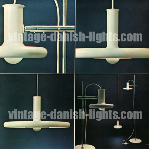
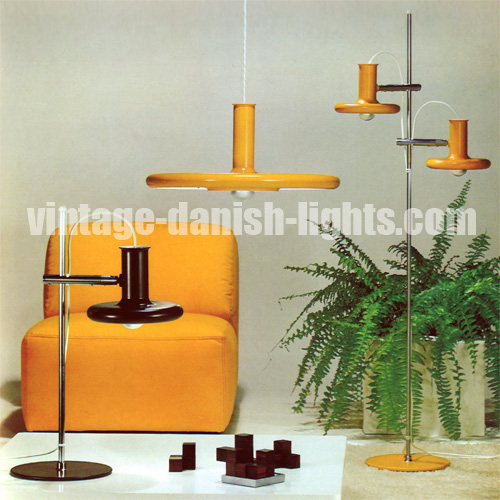
An early 70s edition of Design from Scandinavia reveals the material that architects Sidse Werner and Leif Alring used to create the light-transmitting but non-dazzling domed tops of their Formland lamp series for Fog & Morup (pictured below):
The metal parts of the fittings are lacquered in white, red, turquoise or yellow, and the shining calotte is made of buturate [aka butyrate], the only material that permits one to look at the filament of the bulb without being dazzled by it.
The Polymer Plastics Corporation explains what butyrate is:
Butyrate is a cellulose ester modified by using butyric and acetic acids, producing cellulose acetate butyrate, or CAB. Unlike other common synthetic plastics, the cellulosic plastics are not manufactured by polymerising a monomer. Instead, they are produced by the chemical modification of cellulose, a natural polymer. Cellulose itself is not a thermoplastic, since it will not melt. Yet by the viscose process, it is made into film (cellophane) and into fibre (rayon) that compete with the products of its thermoplastic derivatives.
Cellulosics as a group are characterised by good strength, toughness and high surface gloss. In addition, they have good chemical resistance, good clarity, sparkle, and will take decoration readily. CAB is tougher than acetate and has lower moisture absorption. It resists weathering and has excellent transparency. Although it is adversely affected by alcohol, alkalis, paint removers and acetones, it is resistant to most household chemicals. Additionally, CAB is resistant to the harmful effects of ultraviolet radiation.
-

Quality System – back from obscurity
From its inception in 1965 until its demise in 1985, Danish lighting company Quality System was hugely successful, and its products, designed by artist Flemming Brylle and industrial designer Preben Jacobsen, sold in the millions. For the next two decades, however, the company’s name was all but forgotten, due partly to the fact that its products – mostly self-assembly plastic lamps – carried no branding except on their packaging, which would tend to be discarded once the light was assembled.
Even the company’s metal-bodied Moon Light, which continues to pop up from time to time, never seems to have any labels attached and is thus usually unrecognised, sellers often simply describing it as being “like a Panton Flowerpot”. The lack of trace left by the company was exacerbated by the apparently low profile it kept in advertising. A rare 1970 Quality System advertisement, reproduced below, offered the following information about the company’s products:
Some of Denmark’s best-selling lights, familiar in most parts of the world, can now be ordered direct to your home. Lights that can be assembled in a very short time, manufactured in antistatic polyacrylic – a material with very fine light-dispersing qualities that is also easy to clean. These 10 lamps (from a total of 63 different models) have been created by famous designers, and fit perfectly into today’s residential milieu. New lighting throughout the home straight to your door.
(1) Cosmo Lights, (2) Confetti Light, (3) String Light, (4) Moon Light, (5) Twin Light, (6) Fleur Light, (7) Easy Light, (8) Classic Light, (9) Hi-Light, (10) Twister, (11) Moon Lights.
In 2003, astonished at the exorbitant prices they saw vintage Quality System lights being sold at, Brylle and Jacobsen re-established the company and began producing new retro-style designs, meeting once again with immediate global success and selling more than half a million units in the first six months of operation.
-

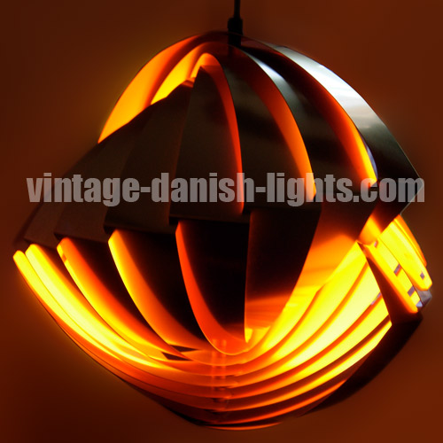
The mysterious Danish star light
One of the many vintage Danish lights we count among our favourites is the large (50cm diameter), heavy (3kg) and fearsomely spikey star-shaped fixture pictured below. But its origins are an enduring mystery to us. Over the past decade we have seen examples of the light with apparently genuine Lyfa labels and others with Nordisk Solar Compagni ones. This is not in itself a great surprise, as we know that both these companies occasionally lent their branding to lamps that were actually produced by third parties – independent manufacturers like Claus Bolby, for example.
But if both sets of labels are indeed genuine, who was that unacknowledged third-party producer? And who was the designer? We have seen various claims in regard to the latter role over the years, among them Alfred Homan, Anton Holm, Alfred J Andersen and Simon P Henningsen, but none of these have been backed up with any primary-source evidence, and the profile of Simon Henningsen on our sister site classic-modern.co.uk clearly rules him out. We’d love to hear from anyone who has any reliable information about this light – please email us at info@vintage-danish-lights.com.
UPDATE NOVEMBER 2012: Click here to read how we discovered the answer to this mystery.

-

Weisdorf’s Konkylie was made for trees
Louis Weisdorf’s extraordinary Konkylie (“conch shell”) light was originally designed for Copenhagen’s Tivoli Gardens, where it hung from trees in glorious fiery clusters. Like Simon P Henningsen’s Divan 2, also designed for Tivoli, the Konkylie was subsequently put into general production by Lyfa. Already confident of its enduring appeal, a 1967 Lyfa advert described the Konkylie in the following terms:
Louis Weisdorf MAA is a young architect with a strong sense of form. With his creative and technical understanding, he has designed a series of lights for Lyfa – the Konkylie lamps, available in “silver” or “gold”. A truly fascinating light, which will one day become a classic.
-

Piet Hein’s 1969 Ra lamp for Lyfa
Bengt Rooke’s Tidsfasetter, a collation of historical art and design news items from Scandinavia, includes a 1969 clip entitled Piet and Lux and Lyfa, which reports on the innovation behind Piet Hein’s Ra lamp design for Lyfa (pictured below). Here is our translation:
Piet Hein, the Dane who has achieved world renown as a theorist, inventor and poet, has created a new lamp for Lyfa A/S. Piet Hein calls his lamp the Ra lamp, after the ancient Egyptian sun god. The Ra lamp has been introduced both in Denmark and in the international market, and is based on a new Piet Hein discovery – isoluxfladerne – which basically is a way of providing as much regular light as possible without dazzle. After Grooks and Superelipses and much more, Piet Hein now offers us a bright new light.
We have not translated the Danish term for Piet Hein’s discovery isoluxfladerne, not least because we couldn’t come up with a neat equivalent in English. The word has three components, the first of which – iso – is derived from the Greek word isos, meaning equal. The second component – lux – is the SI unit of illuminance, equal to one lumen per square metre, and more generally means luminescence or simply light. The third component – fladerne – is Danish for surfaces. Piet Hein’s innovation in the Ra lamp is thus, as described in the clip, the illumination of surfaces in an even (and non-dazzling) manner.