Danish architect Sophus Frandsen created the Fibonacci light, his timeless classic for Fog & Mørup, in the early 1960s. Despite being one of the company’s most expensive lights – the various versions costing from 10 pounds six shillings to 17 pounds seven shillings in the UK in 1963, when the average weekly wage was 20 pounds 16 shillings – it remained in production until F&M’s demise in the early 1980s. The light was awarded the gold medal at the Leipzig Messe in 1967 and was selected for inclusion in the show Die gute Industriform at the 1968 Hannover Messe.
Danish lighting designer Henrik Clausen presents a fascinating video profile of Sophus Frandsen at the Fagerhult Lighting Academy, which we have transcribed here:
“I hope that I am not going to tell you anything here today that you don’t already know!” The person who said these words expected a lot from his audience. But at the same time he stepped down from the pedestal just by saying these words. For of course we all knew that we were listening to a real master in understanding light, lighting and lighting design. [Shows picture of Frandsen.] Here you see the person who made a big difference in my life. The picture is taken at Sophus Frandsen’s 80th birthday. He has become a living legend in the Danish lighting community. He had a lifelong position teaching light, lighting and lighting design at the Royal Danish Academy of Fine Arts in Copenhagen. I attended his lectures 25 years ago. He taught us about perspectives, and illustrated them with ancient Chinese arts. He showed that we feel less distance between mountains when the artist puts down cloud and mist. The clouds give a soft and diffuse light, and the artist often uses a cool and blueish light to create the feeling of distance. Nature clearly teaches us the same thing. The further away an object is, the more soft and blueish the light gets, and the mist or the low-hanging clouds diffuse and taint the light. It creates depth and perspective.
Sophus often brought this old 6×6 light projector along. The light source is of course incandescent. Sophus would never use anything other than that, because he insisted on perfect colour rendering. Before he projected anything he made us watch the empty screen only showing a huge white square. Then he got out his slides. But his frames didn’t hold any beautiful pictures. They held all sorts of samples of clear glass used for window glazing – samples from all over the world made in different countries from different moulds. Glass is not just glass. Even clear glass changes the colour of the light. We looked at all kinds of different samples, sitting there watching the big square on the screen turn from white to soft blueish to green, and then you suddenly understood that light had to be treated with respect. And that’s exactly what Sophus did.
When Sophus worked, there were no such things as lighting designers. Lighting was an integrated part of architecture. Nevertheless, Sophus was a true lighting designer – but most of all, he taught us all how to see. And for that I am forever grateful.
Clausen’s presentation provides an interesting context for the instruction in a late 1970s Fog & Mørup catalogue to fit clear (rather than opalescent) bulbs in Frandsen’s Fibonacci. The catalogue says:
The Fibonacci is a lamp where the designer has done much work around the screening of the bulb, and the result is almost complete anti-dazzling in all directions. Fibonacci can therefore be suspended high or low as one prefers without dazzling, at the same time giving an even, diffuse illumination of the room. The light, airy design makes it suitable in almost any interior and for any style. For the Fibonacci lamp only clear bulbs should be used, as anti-dazzling and the right distribution of light can only be obtained with the correct bulb. The lampholder is adjustable to the various bulb sizes, so that the distance to the shades can always be correct.
Month: November 2010
-

Frandsen’s Fibonacci needs clear bulbs
-

Nordisk Solar vs Anvia star lamps
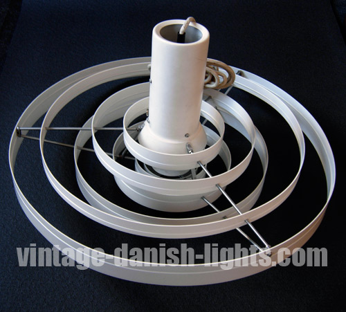
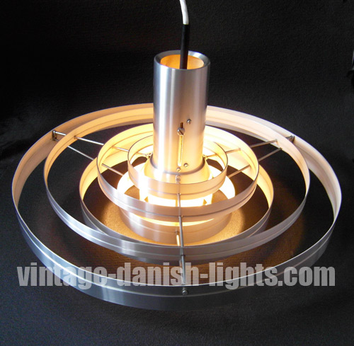
The star-shaped lacquered steel pendant light pictured below seems to embody the space-age style of the late 60s and early 70s, but in fact it was designed for Nordisk Solar Compagni at the beginning of the 1960s by Danish architects Niels Esmann & Hans C Jensen.

A news item in the October 1961 issue of Danish homestyle magazine Bo Bedre (illustrated with the picture below) reveals that the lamp’s 11 intersecting metal layers and the internal bracket holding them together would later become available as individual items, allowing the purchaser to build a lamp to their own height requirements – though we have seen no evidence that this feature was ever actually introduced.
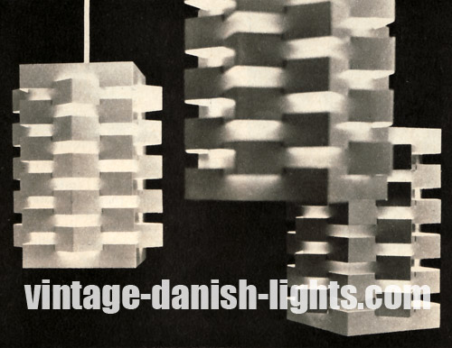
The metal layers were available in white, grey, purple or orange, and at the time of the lamp’s introduction all had white interior surfaces, though this was subsequently changed to full colour throughout as seen in our own images (top and below).
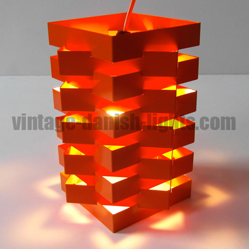
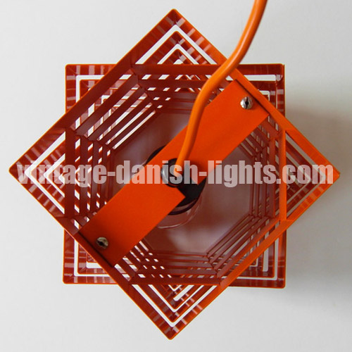
The lamp is easily confused with another of very similar construction that was in production in Holland at around the same time. Usually attributed to JJM Hoogervorst for Anvia Almelo, the Dutch lamp can be distinguished from the Nordisk Solar version by the existence of a narrow metal rod attaching the bulbholder to the topmost metal layer. In the Nordisk Solar Compagni version this function is performed by a much wider metal bar (see image below), and the entire electric fitting slips freely in and out of the bar in the traditional Nordisk Solar style.
Furthermore, the Anvia versions usually have only nine layers, and sometimes seven, instead of the Nordisk’s 11 – though the possibility of other Nordisk combinations cannot be dismissed. But the clearest difference is that while the Nordisk lamp’s layers are of equal depth throughout, the Anvia layers are alternately thinner and wider – and the two widths are usually also different in colour.
-

Colour coordination in Danish lights
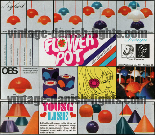
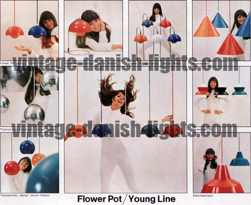
In the late 1960s both Louis Poulsen and Fog & Morup launched lines of assorted lamp models in coordinated colours under unifying banners. In 1968 and 1969 Louis Poulsen’s Young Line embraced the company’s Combipendel, Søvaernspendel, Emaillearmatur, Billiardpendel and the Verner Panton-designed Topan and Flower Pots, and was offered in orange, red, turquoise, blue and (for some of the models) white.
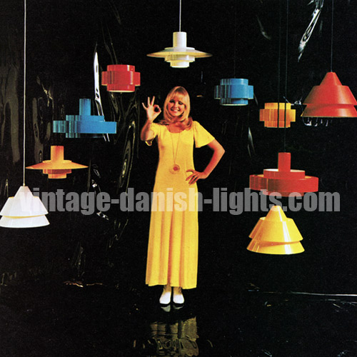
Fog and Mørup, meanwhile, launched its Rainbow Line (pictured below) in 1969, bringing together the Falcon, Juno, Zone and Equator in red, yellow, blue and white versions. This was closely followed by the White Line, a counterpoint to the vibrant colours of the Rainbow Line and marketed as “attractive, simple lights [that] can be used in almost any interior, irrespective of colour key or materials”.
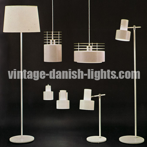
The White Line (below) featured the Viking and Junior floor lamps, the Alpha and Corda wall lamps and the Lento table lamp, all of which had been produced previously in other colours or finishes, and the multi-haloed Hydra (centre top of picture), a new light in two versions which would only ever be produced in plain white.
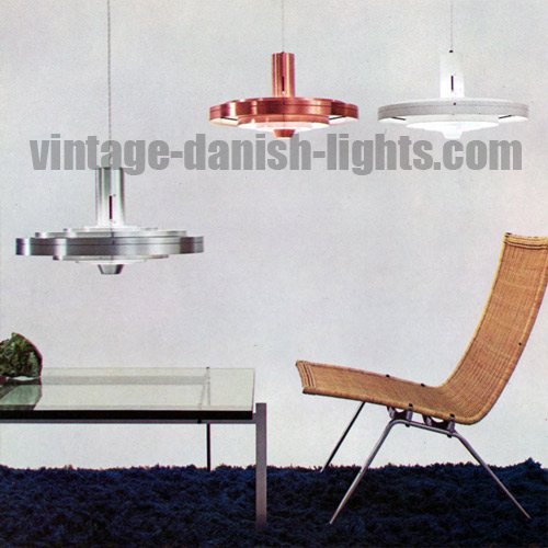
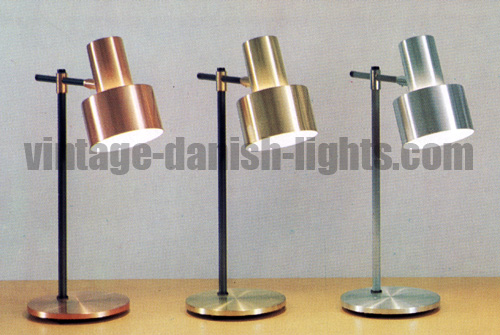
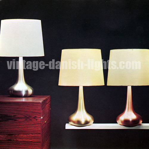
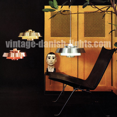
The idea of cross-model colour coordination was in fact deeply embedded in Fog & Morup culture, and had long been pursued on an informal basis, with many lamp models in the early 1960s being produced in three separate metal finishes – aluminium, brass and copper – allowing the customer to choose different models for different areas of the home and still achieve a harmonious look throughout (see, for example, the Lento and Orient table lamps and the Nova pendant light, pictured in the following three images).
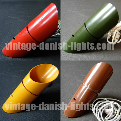
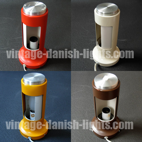
Indeed, colour coordination across models was a permanent feature of the F&M landscape during Jo Hammerborg’s reign as director of design through the 1960s and 1970s, the unifying colours changing over time as tastes and fashions altered. The mid to late 1970s, for example, saw F&M models including the Poker, Arabia, Pfister (first image below), Contact (second image below), Bunker, Flora, Markise and Aktiv being offered in various combinations of that period’s key colours of yellow, orange, red, brown, green and white.
-

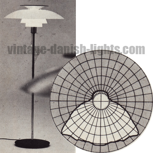
PH 80 is not a Poul Henningsen design
It is easy to understand why the claim is often made that Louis Poulsen’s PH 80 table and floor lamps were designed by Poul Henningsen himself. But they were actually designed by Bent Gantzel-Boysen and issued by Louis Poulsen in 1974, some seven years after Henningsen’s death, as a tribute to Henningsen marking his 80th birthday. We have translated a report that appeared in the November 1974 issue of Denmark’s Bo Bedre magazine:
Recently Poul Henningsen would have reached 80 years of age, and on this occasion Louis Poulsen & Co A/S issued a new table and floor lamp. It is called PH 80 and has been designed by Bent Gantzel-Boysen to follow in the footsteps of PH’s famous lamps. The new PH lamp absorbs more of the bulb light than its predecessors – because the shade here is of white acrylic, not metal. But it is just as reflective and gives a light as uniformly bright as PH’s own lamps. The distribution of light can seen in the graph below, in which the measured brightness in all directions has been plotted every 10 degrees. As can be seen, the lamp gives a very bright light and even coverage over a fairly large field.